Preview image. Unlock full-res
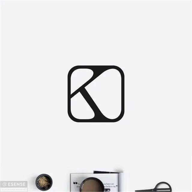
Monogram featuring the letter K formed by strategic negative space and a diagonal stroke, contained within a rounded-corner square frame.
Summary
Monogram featuring the letter K formed by strategic negative space and a diagonal stroke, contained within a rounded-corner square frame.
Visual description
Solid black rounded square (corner radius approximately 20-25% of the square edge) anchors the composition. Within it, two white shapes create the K: the vertical stem on the left (a tall, narrow rectangle running full height) and a diagonal slash (angled roughly 35-45 degrees) crossing from top-left to bottom-right, with a curved white void in the upper-left quadrant (the bowl of the K). The stroke weights are balanced, and the negative space is as intentional as the positive form. Light-gray or off-white background emphasizes the high contrast. Small branded elements (a logo lockup or wordmark) appear at the bottom-left corner of the composition shot, contextualizing this as a brand identity in use.
Key takeaway
The negative-space letter approach is more ownable and memorable than a simple outline: it forces the reader to complete the form mentally. The diagonal slash breaking through the vertical stem creates dynamic tension within an otherwise stable square. The rounded-corner container softens the geometric rigor without compromising modernity, making it suitable for premium or lifestyle brands that might find a perfect square too cold.
Reuse notes
Excellent for luxury, design, creative, or tech-adjacent personal brands or startups. The K-specific monogram limits reuse unless your brand starts with K, but the negative-space letter technique is exportable to other initials. Works well at small scale (icon/favicon) because the clear stroke distinction remains readable. Pairs naturally with condensed or all-caps sans-serif wordmarks. The rounded square is current (circa 2020-2026) and signals contemporary design thinking without feeling trendy.