Preview image. Unlock full-res
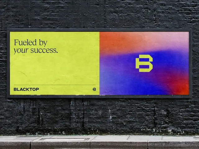
Two-panel mark combining a yellow typographic panel and vibrant blue-to-purple gradient hosting a single letter initial.
Summary
A clean two-column identity combining branded typography on a yellow-lime panel with a vibrant blue-to-purple gradient field holding a single-letter mark in white.
Visual description
Left side: "Pocket by [company]" set in a sans-serif face on a bright yellow-lime background with subtle dark texture. Right side: a bold blue-to-purple gradient (bright royal blue at the left edge transitioning to deep magenta/violet at the right) with a large white sans-serif "B" mark floating center. The two panels sit flush against a dark textured surface, photographed at an angle that hints at physical application or mockup.
Key takeaway
The color-split approach creates immediate brand duality without complexity. One vibrant gradient field plus tight monochromatic copy on a flat field is a pattern that works at small and large scales. The letter-mark in the gradient field solves the problem of a wordmark that reads at multiple sizes.
Reuse notes
Strong template for tech or fintech brands wanting energetic, memorable marks. Works on dark backgrounds and apps. Pair with the yellow panel for co-branded contexts or assets that need separation.