Preview image. Unlock full-res
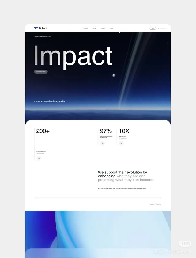
Full-height dark blue gradient hero with large sans-serif headline, navigation bar, and lower stats grid showing metrics in white.
Summary
A landing page layout for Tirtus (described as an "award-winning boutique studio") featuring a dark navy gradient hero with a large "Impact" headline, overlaid CTA button, and three-column stats grid below.
Visual description
The page stacks a navigation bar at top (white background, navy logo, product/contact/design/about links, sign-in button) over a hero section dominated by a deep navy-to-blue-gradient background suggesting a cosmic or atmospheric scene. White sans-serif text reads "Impact" as the main headline, with a gray-labeled "Sustainable Future" section above and a darker CTA button ("Sustainable Future") below. Below the fold, a white background holds a left-aligned grid of three metrics: "200+ universes created", "97% clients end up for their better side", and "10X team turnover", each with small arrow icons. Footer tagline: "We support their evolution by enhancing who they are and projecting what they can become."
Key takeaway
The atmospheric gradient hero using cool blues and depth to convey innovation and scale. The stark typography contrast (white, oversized sans-serif) against dark background ensures readability. The three-stat layout is simple but anchors credibility without overloading. Subtle gradient direction and particle/glow effects add sophistication without clutter.
Reuse notes
Strong for B2B consulting, SaaS, or analytics brands wanting to project confidence and innovation. The dark gradient and cool palette work best when paired with clear CTAs and quantified social proof. Avoid for consumer/playful verticals; the tone reads serious and premium. Works well on desktop; mobile adaptation not visible here.