Preview image. Unlock full-res
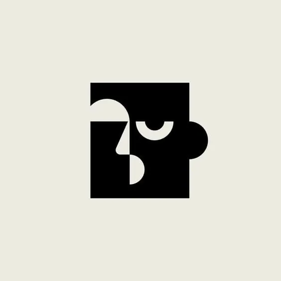
A minimalist monoline logo mark rendered in white against solid black, using interlocking curved forms that suggest motion or an incomplete spiral.
Summary
A minimalist monoline logo using interlocked curved strokes to suggest motion, rendered as a white figure against solid black.
Visual description
The mark consists of smooth, flowing lines that intersect to create an abstract form resembling a spiral or curved letter. The design uses a single stroke weight throughout, creating a harmonious composition with one internal cutout that generates contrast and depth. The extreme contrast between pure white and pure black demands precision in the line work; the curves are confident and flowing, anchored by small geometric intersections at junction points. A copyright mark sits small in the lower right.
Key takeaway
The discipline of using a single stroke weight to build a complex visual form. The interplay of positive and negative space where the internal void becomes as important as the outline. The scalability of the monoline approach across applications (icon, mark, app).
Reuse notes
Excellent reference for minimalist brand marks or app icons. Works equally at large print scale and small digital sizes. Monoline construction means fine lines disappear below ~100px; pair with solid icons for small-screen applications.