Preview image. Unlock full-res
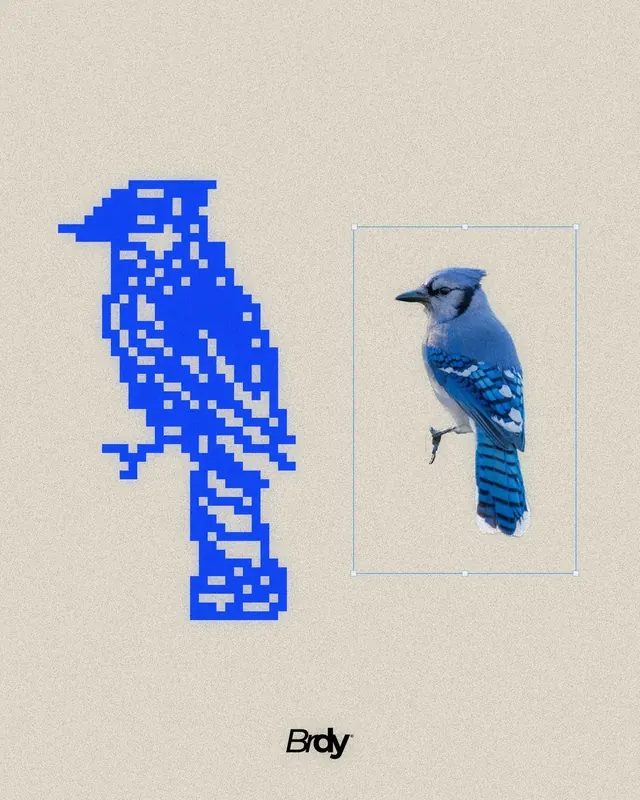
A side-by-side branding or identity concept showing a blue jay in pixelated and photorealistic forms, labeled Brody.
Summary
A branding study comparing a blue jay across two contrasting visual languages: a blocky pixelated blue form on the left and a photorealistic reference on the right, marked with the identity "Brody".
Visual description
A cream or off-white background holds two blue jay renderings in isolation. On the left, a strictly geometric pixel-art interpretation built from bright blue squares arranged in a 8-bit style silhouette. On the right, a photorealistic photograph of an actual blue jay mounted in a light teal reference frame, showing the bird's natural plumage, posture, and fine detail. Below both sits the sans-serif logotype "Brody" in italics. The rigid geometry of the left contrasts sharply with the organic detail on the right.
Key takeaway
The direct visual pairing of abstraction and reference to justify design decisions. The pixel treatment demonstrates how far geometric reduction can push while remaining recognizable. The layout uses negative space and the rectangular frame to suggest constraint and intentionality, not accident.
Reuse notes
Strong for design education, brand-identity case studies, or illustration/animation studio portfolios. The dual treatment works well to show both concept and photographic source. Avoid pairing with work that needs a single cohesive visual voice.
More like this







Keep what you find
A free account saves references to boards and can send you a weekly email of picks based on what you save.
To see every result, go Pro.