Preview image. Unlock full-res
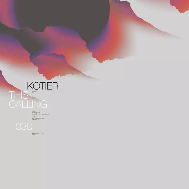
Editorial magazine cover for 'Kotier This Calling' using organic gradient shapes in warm pinks, reds, and purples that flow across a light background.
Summary
Magazine cover for "Kotier This Calling" featuring abstract organic gradient shapes that flow and blend across the upper two-thirds of the composition in warm mauve, red, and coral tones.
Visual description
Flowing abstract shapes in warm gradients (coral, red, mauve, purple) dominate the upper portion, with each shape rendered in soft color transitions that blur and blend seamlessly into adjacent areas. The shapes have rounded, organic edges suggesting movement. A light cream/grey background occupies the lower third. Centered text reads "KOTIER" and "THIS CALLING" in clean, light sans-serif type, with smaller subtext and issue number "030" positioned lower.
Key takeaway
The soft gradient-shape technique for masking large areas of color change without hard edges; the compositional balance of heavy abstract top mass against restrained, centered typographic axis; the discipline of restricting palette to one warm color family for cohesion.
Reuse notes
Strong for editorial magazine covers, design studio branding, or promotional materials where atmosphere matters more than precision. Works best with strong typographic anchors below the shape composition. The soft palette reads upscale and contemporary rather than corporate.
More like this




Keep what you find
A free account saves references to boards and can send you a weekly email of picks based on what you save.
To see every result, go Pro.