Preview image. Unlock full-res
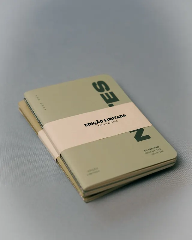
Stacked cream and taupe notebooks with a centered pale band wrapping around, displaying dark serif branding text and fine print.
Summary
A stack of three notebooks bound together with a pale cream band, featuring dark green serif and sans-serif typography identifying the brand and edition details in Portuguese.
Visual description
Three notebooks are stacked slightly offset at a gentle angle on a neutral gray background, shot at 45 degrees to show depth and materiality. The front notebook cover is cream or off-white paper, with the geometric green wordmark "ES" (or similar serif letterforms) positioned in the upper right. A pale cream-colored paper band wraps horizontally across the middle of the stack, bearing the text "EDICAO LIMITADA" (limited edition in Portuguese) above smaller sans-serif type reading "LUXO ACERVO". The back visible cover is taupe or muted sage toned. Small fine print appears at the bottom of the visible front cover indicating page count and dimensions (e.g. "60 PAGINAS CR 75g 185x 140"). The paper stock is clearly matte and tactile, with visible edge grain suggesting quality binding. The entire composition emphasizes the physical object and craftsmanship.
Key takeaway
The horizontal band creates visual containment and hierarchy without loud color or excessive detail. Limiting the palette to warm neutrals and a single accent green keeps the identity sophisticated and timeless. The stacked, offset presentation signals a curated set or collection while the fine print and Portuguese text reinforce an editorial or regional identity.
Reuse notes
Perfect for publishing, design studios, or heritage-brand identities prioritizing tactile materiality and restraint. The band technique works well for bundled products, stationery sets, or limited-edition releases. Works best with high-quality paper finishes and photography that reveals texture and layering. The serif wordmark pairs elegantly with this approach for premium positioning.
More like this


Keep what you find
A free account saves references to boards and can send you a weekly email of picks based on what you save.
To see every result, go Pro.