Preview image. Unlock full-res
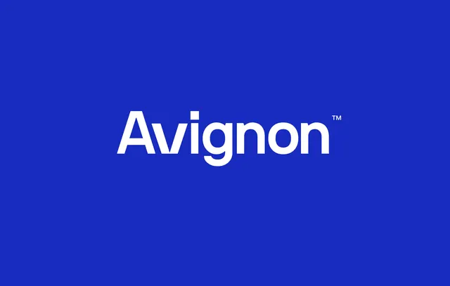
Wordmark logo for Avignon set in geometric sans-serif (trade-gothic style) on a vibrant cobalt blue field, with a TM superscript, centered and floating in ample negative space.
Summary
Wordmark logo for Avignon set in geometric sans-serif (trade-gothic style) on a vibrant cobalt blue field, with a TM superscript, centered and floating in ample negative space.
Visual description
The word "Avignon" is rendered in a bold, condensed geometric sans-serif with tight letter spacing. All characters are in white at a large display size, perfectly centered horizontally and vertically on the cobalt blue background. A small TM symbol appears in the upper right of the letter cluster. The typeface has squared-off terminals and consistent stroke weight, giving it a 1970s-80s corporate feel balanced with contemporary minimalism. Generous negative space surrounds the logotype on all sides, allowing the form to breathe and command attention without competing elements.
Key takeaway
The letterform geometry is the primary visual asset: the type itself functions as the identity. The combination of bold weight, condensed proportion, and geometric construction creates instant memorability. The bright blue ground ensures the white mark pops at both large and small scales while projecting stability and premium positioning.
Reuse notes
Strong for B2B consulting, fintech, or technology companies seeking an authoritative, modern identity. The simplicity ensures the mark works equally well on a building sign, business card, website favicon, or app icon. Pair with a secondary sans-serif in a lighter weight for body copy and UI. The blue grounds well for dark-mode interfaces and light backgrounds alike.
More like this







Keep what you find
A free account saves references to boards and can send you a weekly email of picks based on what you save.
To see every result, go Pro.