Preview image. Unlock full-res
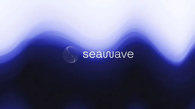
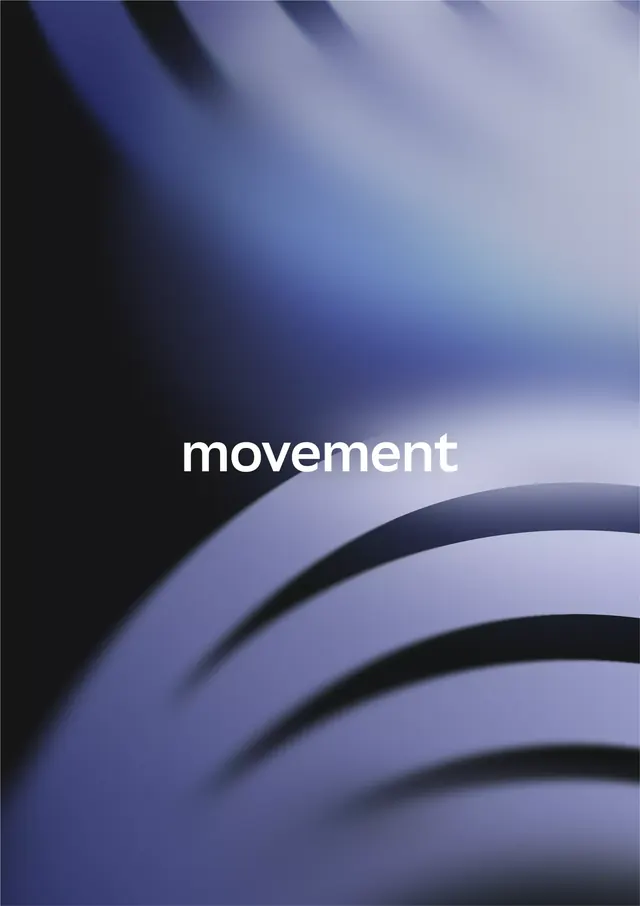
Organic curved wordmark in white set against a dark-to-light navy gradient with layered arc shapes creating depth and visual momentum.
Summary
Organic curved wordmark "movement" in white against a soft navy-to-pale blue gradient, with layered arc bands creating visual depth and suggesting motion.
Visual description
A horizontal composition with soft gradient background transitioning from charcoal and deep navy in the upper left to pale lavender blue on the right. The word "movement" appears in a clean, condensed sans-serif in white, positioned center-right. Behind and below the text, three thick curved bands in navy, light blue, and darker tones layer diagonally across the lower half, creating a sense of forward motion. The curves echo organic, flowing shapes that frame the typography without overwhelming it. Generous negative space at the top balances the layered geometric forms below.
Key takeaway
The restrained use of layered curved shapes as a supporting design element rather than a primary focal point. The soft gradient background that suggests depth without competing with the word. The interplay between precise typography and organic, fluid forms in a single composition.
Reuse notes
Works well for brands in tech, wellness, or creative sectors that want to convey movement and sophistication without heaviness. The gradient can be adjusted to other color ranges. Best paired with minimal additional imagery to maintain clarity.