Preview image. Unlock full-res
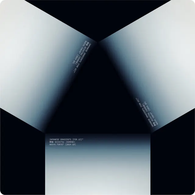
A dark poster where three smooth blue-to-white gradient planes fold inward to form a 3D box corner, captioned in small mono type as a Japanese UI-gradient release.
Summary
A near-black rounded-corner poster on which three soft blue-to-white gradient panels meet at a central vertex, folding like the inside corner of a box. Small monospace captions label it as a Japanese UI gradient set.
Visual description
Three large quadrilateral planes, each carrying a smooth gradient from cool slate-blue through pale silver to white, are angled so their edges converge at a single point just above center, reading as a 3D concave corner against the deep navy-black ground. Tiny light-gray mono/all-caps type runs along the inner fold seams and again in a left-aligned block lower down: "JAPANESE GRADIENTS [FOR UI]", a line of Japanese characters with "SEIHITSU [SERENE]", and "NUEVO.TOKYO [2024 Q4]". The type is set rotated to follow two of the seam edges, mirroring left and right. The overall feel is a quiet, architectural product card.
Key takeaway
Using gradient fills as the only light source to imply 3D geometry: flat panels become a folded box purely through gradient direction, no shadows or rendering. Also the trick of running caption type along the angled seams so the labels reinforce the form instead of floating on top of it.
Reuse notes
A clean template for a "drop" or release card (type packs, gradient packs, UI kits) where the artifact itself is abstract. The rotated seam-following captions read as intentional and technical. Caveat: gradient banding shows on low-bit displays, so export with dithering for dark backgrounds.