Preview image. Unlock full-res
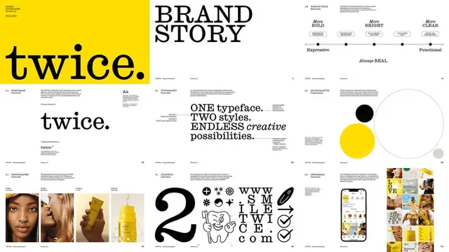
Multi-page brand guideline spread for 'Twice' with bold black sans-serif type, bright yellow color block, high contrast imagery, and pattern variations.
Summary
Multi-page brand guideline spread for Twice with bold black sans-serif type, bright yellow color block, high contrast photography, and a modular pattern system.
Visual description
Horizontal spread showing 6-9 pages of a brand guideline. Left third features the word "twice." in black ultra-bold sans-serif on a bright yellow background. Center section titled "BRAND STORY" in large black type with supporting body copy and subsections labeled "As", "ONE typeface. TWO stories. ENDLESS creative possibilities." Right third shows a color palette with black and yellow circles, photography grid in warm tones, and a modular pattern system with icons, symbols, and checklist elements in black and yellow. All elements sit on white space with generous margins. High contrast between black type, white background, bright yellow accent, and warm photography tones.
Key takeaway
The extreme confidence of single yellow as a brand color against pure black and white, avoiding any dilution; the pattern system that extends the brand language beyond solid colors into modular marks and symbols; the way large oversized headline type carries the entire brand identity alongside photography.
Reuse notes
Ideal template for creative agencies, design studios, or software brands that want confident, opinionated identity systems. Works across print and digital because of the high contrast. Requires bold typeface choices and discipline to avoid introducing secondary colors. The yellow can be replaced with any vibrant accent but must stay saturated to maintain contrast.
More like this



Keep what you find
A free account saves references to boards and can send you a weekly email of picks based on what you save.
To see every result, go Pro.