Preview image. Unlock full-res
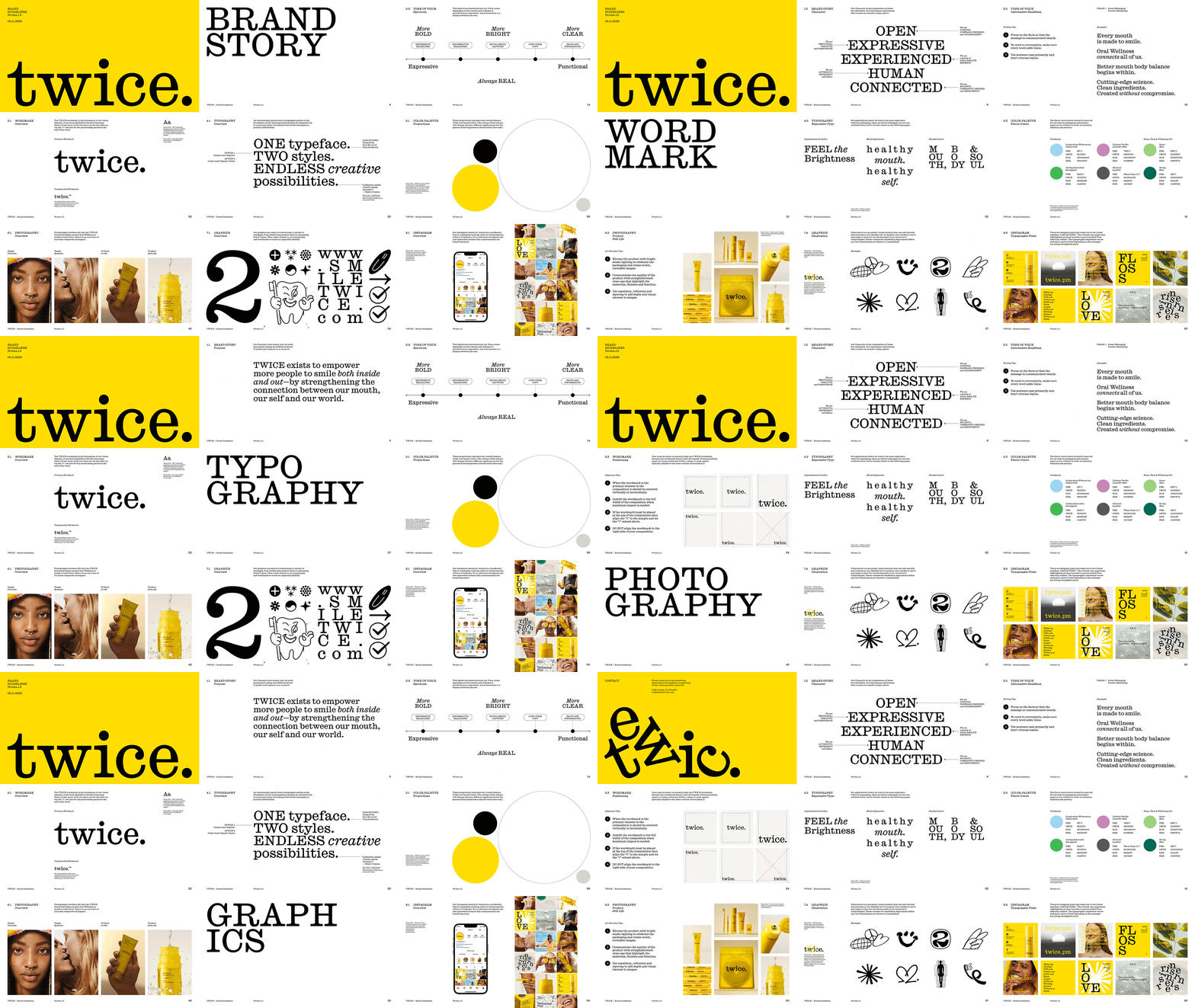
Brand guidelines for Twice using black and yellow against white, centered on a single bold serif typeface with expressive color rules and integrated photography and graphics systems.
Summary
A comprehensive brand identity system for Twice using a single primary serif typeface paired with precision sans-serif and a bold yellow and black color palette across photography, graphics, and digital guidelines.
Visual description
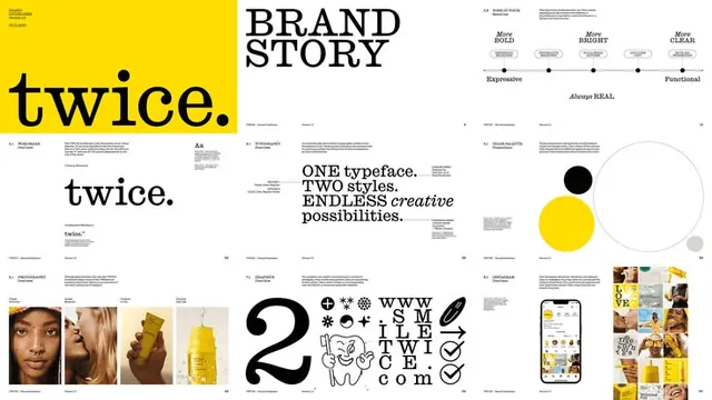
Multi-page spread from a brand guidelines document. Left pages show the wordmark "twice." in black serif on a yellow field, followed by anatomical details of the primary serif typeface. Center pages present the typographic system with "ONE typeface. TWO styles. ENDLESS creative possibilities" and color swatches of warm neutrals and near-black. Right pages display a tone-of-voice spectrum (from "Expressive" to "Functional"), photography rules showing color-treated portraits in yellow overlay, and a comprehensive graphics system with varied black marks, icons, and ornamental elements. An Instagram guidelines section shows 12-tile thumbnail layouts with the yellow accent color. All typography is set in the house serif with clean hierarchy and deliberate negative space.
Key takeaway
The discipline of combining one serif face with functional sans-serif only, not competing typeface families. The yellow color restriction as a unifying graphic device across photography, icons, and word marks. Photography rules that show how a single color treatment brings visual coherence to diverse image types.
Reuse notes
Use as a template when building guidelines for a design-forward brand: establish a single primary typeface, restrict color severely, and show how it applies across real contexts (photo treatments, icon systems, digital layouts). Works especially well for portfolios, design studios, and creative agencies wanting to project both playfulness (via yellow) and authority (via black serif).
More like this








Keep what you find
A free account saves references to boards and can send you a weekly email of picks based on what you save.
To see every result, go Pro.