
Preview image. Unlock full-res
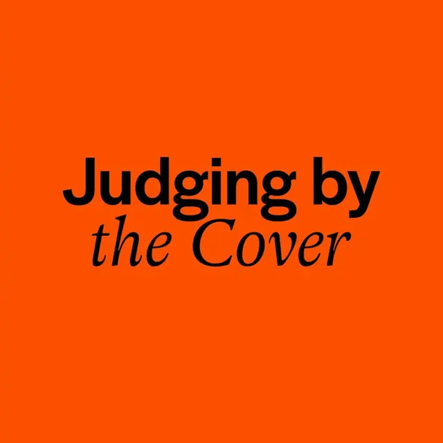
Black serif text in mixed roman and italic on a vibrant orange background, demonstrating high-contrast typographic restraint.
Summary
A type specimen pairing a vibrant orange field with black serif text in mixed roman and italic weights, reading "Judging by the Cover." The composition demonstrates editorial restraint and color-blocking discipline.
Visual description
Centered on a full orange background, two lines of large black serif type: the first line "Judging by" in roman weight, the second "the Cover" in italic. The serif typeface has generous letterforms with moderate contrast and distinctive italics. White space surrounds the text evenly. The orange is a rich, warm saturated tone that reads as a statement color rather than a neutral background. The simplicity is absolute: no auxiliary elements, no layering, text only.
Key takeaway
The direct use of a single bold background color as a design statement itself, letting typography carry all visual hierarchy. The pairing of roman and italic weights for tonal variation without introducing a second typeface. The psychological power of centering type on a hot color without needing photography, illustration, or secondary design moves.
Reuse notes
Effective as a book or exhibition cover, editorial header, or poster headline. Works for publishing, cultural, and media contexts where a statement is the goal. Requires bold color confidence and strong typography to pull off. The high contrast ensures legibility even at small reproduction sizes.
More like this








Keep what you find
A free account saves references to boards and can send you a weekly email of picks based on what you save.
To see every result, go Pro.