Preview image. Unlock full-res
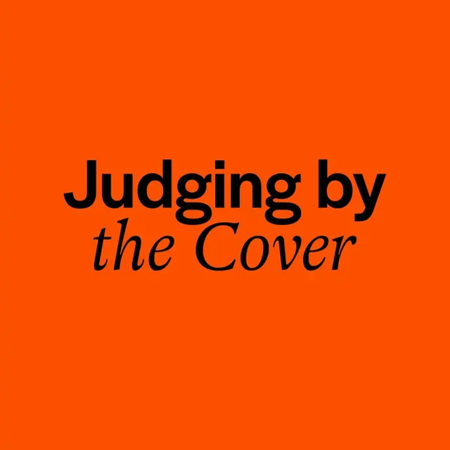
Bold typographic specimen poster pairing black serif and italic fonts against a saturated orange background to demonstrate type contrast and personality.
Summary
Bold typographic specimen poster pairing black serif and italic fonts against a saturated orange background to demonstrate type contrast and personality.
Visual description
A full-bleed orange background fills the frame, centered with stacked typography. The words "Judging by" appear in heavy black serif display type (likely a modern serif family), while "the Cover" sits below in a matching italic weight, creating dynamic visual tension. The only colors are the vibrant orange ground, pure black letterforms, and the white negative space of the letters themselves. The composition is vertically centered with generous margins, allowing the type to breathe. The overall effect is striking and direct, typical of a type foundry or typographic journal cover.
Key takeaway
The saturated complementary color (orange and black) as a pure vehicle for type legibility; using italic and roman weights of the same family to add personality without a second typeface; the centered, minimal layout that makes typography itself the only visual element.
Reuse notes
Effective for type showcases, book or journal covers, or branding where a single bold statement matters. Works best when the typeface itself is genuinely distinctive. The high contrast means it reads well at both large and small scale. Orange pairs are uncommon in design; this shows how saturated warm tones can coexist with serious typography.
More like this





Keep what you find
A free account saves references to boards and can send you a weekly email of picks based on what you save.
To see every result, go Pro.