Preview image. Unlock full-res
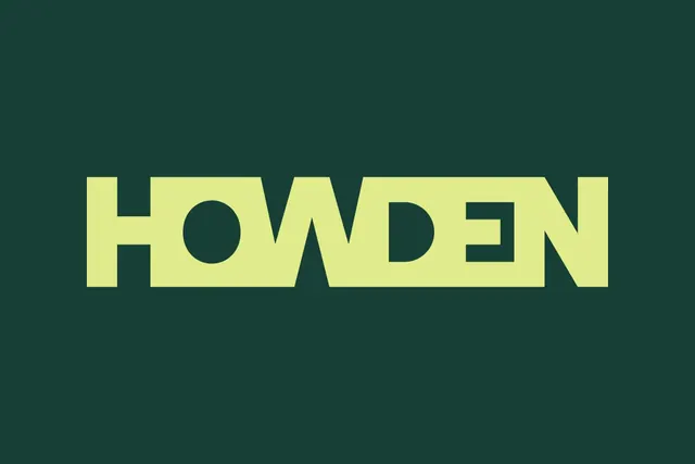
Bold sans-serif wordmark 'HOWDEN' in lime-yellow caps with geometric cutouts, centered on deep teal background.
Summary
Bold sans-serif wordmark 'HOWDEN' in lime-yellow caps with geometric cutouts, centered on deep teal background.
Visual description
The word 'HOWDEN' fills the center frame in a heavy, all-caps sans-serif typeface. The letterforms are solid lime-yellow (#E0EB8B) against a deep, cool teal background (#173F36). Internal negative space reveals geometric voids: a diagonal cut through the H, a perfect circle through the O, and a triangular apex cutting the apex of the A-like final forms. The weight and spacing of the typeface emphasize solidity and presence, while the cutouts add structural subtlety and contemporary flair. No other elements occupy the frame.
Key takeaway
Geometric cutouts in letterforms (rather than applied shapes) create logos that feel structured and intentional rather than decorative. High-contrast color pairing (cool teal and warm yellow-green) reads clearly at any scale and photographs well. The restraint of a single word, single style, no tagline makes the mark scalable and memorable.
Reuse notes
Ideal for tech, energy, or infrastructure brands seeking understated confidence. Works well at small sizes (the O hole remains legible) and scales cleanly to large signage. Cutout strategy requires careful kerning and glyph width; test extensively at small scales before finalizing.