Preview image. Unlock full-res
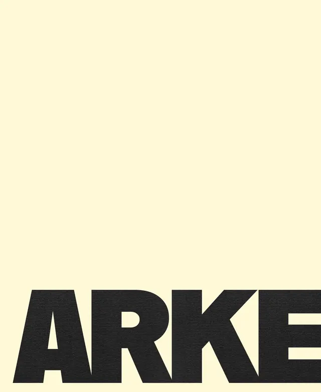
A lowercase sans-serif wordmark in dense, blocky typeface anchored to the lower portion of a soft cream canvas, using weight and negative space as sole design elements.
Summary
A boldface lowercase wordmark in a dense geometric sans-serif, anchored near the bottom of a cream field, relying on typographic weight and vast negative space to project confidence and contemporary authority.
Visual description
The composition is deliberately asymmetrical: a cream or off-white ground occupies roughly 85% of the vertical frame, with the massive wordmark "arke" in bold charcoal sans-serif wedged into the lower 15%. The typeface features uniform stroke weight, geometric letterforms with minimal counters, and tight overall spacing, giving it a monumental, almost architectural quality. The letterforms are chunky and dense, with the lower portions slightly cropped or extending to the frame edge, creating visual tension. Zero decoration, zero ornament, zero auxiliary elements.
Key takeaway
The power of dramatic vertical negative space as a design statement. Using the bottom anchor to create visual weight and forward momentum despite the minimal palette. The restraint of all-lowercase as a confident typographic move. The density and geometric quality of the typeface itself as the only visual interest.
Reuse notes
Works for contemporary corporate, tech, or architectural brands that want to project understated authority. The technique demands a genuinely bold typeface; a lighter weight would read as incomplete. Best at large scale or print; at very small sizes the monumental effect is lost. Pairs well with minimal layouts, generous margins, and restrained color.
More like this




Keep what you find
A free account saves references to boards and can send you a weekly email of picks based on what you save.
To see every result, go Pro.