Preview image. Unlock full-res
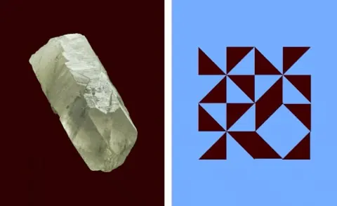
Split composition contrasting a pale sculptural mineral specimen against a bold geometric grid of wine-dark triangles on bright blue, demonstrating abstract/organic contrast in identity design.
Summary
A split-screen diptych pairing a translucent mineral crystal on deep burgundy with a rhythmic triangular grid in wine-red and dark teal on bright periwinkle, creating tension between the organic and the geometric.
Visual description
Left panel: a pale, angular quartz-like mineral specimen centered on a deep burgundy ground. Right panel: a grid of isometric triangles in dark wine-red and dark teal arranged in an interlocking geometric pattern against a bright blue background. The two panels sit edge-to-edge, creating a stark visual contrast between the rough tactility of the mineral form and the precise, constructed geometry of the grid. The color story moves from warm burgundy tones on the left to cool periwinkle-blue on the right, with geometric shapes on the right echoing the angular facets of the mineral on the left.
Key takeaway
The diptych format itself as a branding device: pairing opposing visual languages (natural/geometric, organic/constructed) within a single mark creates immediate sophistication and memorability. The color transition from warm to cool across the divide establishes visual rhythm and reinforces the thematic contrast.
Reuse notes
Effective for luxury brands, design studios, or identity systems that want to signal both technical precision and natural grounding. The strong horizontal division reads well at logo scale and in vertical lockup. Best when the two components can represent opposing brand attributes (craft and innovation, nature and technology, timelessness and contemporary).