Preview image. Unlock full-res
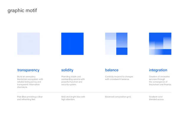
A four-panel concept system using blue geometric blocks and gradients to express blockchain values: transparency (light tint), solidity (pure blue), balance (split grid), and integration (gradient blend).
Summary
A four-panel concept system using blue geometric blocks and gradients to express blockchain values: transparency (light tint), solidity (pure blue), balance (split grid), and integration (gradient blend).
Visual description
Four white-background panels arranged horizontally, each containing a simple geometric shape in shades of blue. The first shows a pale blue square, the second a bold pure-blue solid square, the third a grid of light and dark blue rectangles in asymmetric arrangement, and the fourth a multi-step gradient from white to deep blue across two stacked rectangles. Below each panel sits a concept label (transparency, solidity, balance, integration) in grey sans-serif type, followed by a one-sentence explanation in lighter grey. A horizontal line separates the concept descriptions from a smaller secondary set below, creating visual hierarchy.
Key takeaway
The systematic use of a single geometric form (the square/rectangle) with variations in color intensity, tint, and arrangement to represent abstract concepts. The balance between visual simplicity and conceptual depth. The two-tier text layout (heading + description) that scales complex ideas into digestible chunks.
Reuse notes
Strong for fintech and crypto branding systems needing to explain core values visually. The modular design works as a card grid, infographic element, or presentation system. Works best at moderate scales where the text remains legible; the color differentiation requires good contrast on background.