Preview image. Unlock full-res
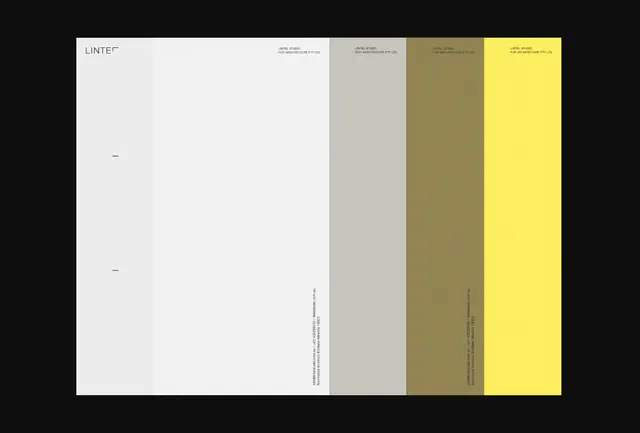
A minimal logo mark composed of three stacked horizontal rectangles, shown in a restricted palette of gold, burgundy, and warm gray.
Summary
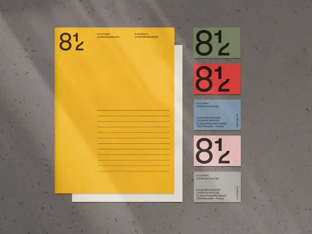
A modular stacked-rectangle logo shown in three colorways: bright gold on cream, maroon on white, and warm gray on white, demonstrating flexible application across backgrounds.
Visual description
The primary mark consists of three horizontal rectangles stacked with tight vertical spacing, creating a compact monogram. A bright mustard-gold version displays on a pale cream background. Adjacent, maroon and gray versions appear on white. The rectangles are proportioned with the top slightly narrower than the bottom two, creating subtle visual rhythm. The logo is presented without supporting text or additional graphic elements, emphasizing the mark's geometric clarity. The three color applications demonstrate palette flexibility across neutral and warm backgrounds.
Key takeaway
The stacked-rectangle as an infinitely scalable, single-color-friendly mark system. Offering the mark in multiple colorways from day one proves it can adapt to business contexts (warm palette for creative, cool gray for professional services). The compressed vertical spacing feels contemporary without sacrificing legibility at small scale. The asymmetry in width variation prevents a purely utilitarian feel.
Reuse notes
Ideal for architecture firms, design studios, and professional services seeking understated authority. The warm palette pairs naturally with contemporary sans-serif type. Works well as a favicon, app icon, or embossed detail. The geometric simplicity means it won't trend quickly. Apply the cream background as a branded color block for distinction, or use the gold/maroon/gray colorways to signal service divisions internally.