Preview image. Unlock full-res
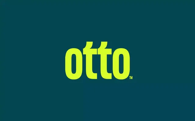
Bold, all-caps sans-serif wordmark OTTO in striking lime-yellow against a solid deep teal background, registered trademark symbol inset.
Summary
Bold, all-caps sans-serif wordmark OTTO in striking lime-yellow against a solid deep teal background, registered trademark symbol inset.
Visual description
Centered composition on a uniform deep teal field. The four-letter wordmark OTTO is set in a heavy, geometric sans-serif with perfectly uniform proportions and stroke weight, rendered in bright neon lime-yellow that virtually glows against the cool background. A small superscript TM sits in the lower right corner of the final O. The typeface has minimal serifs and no flourish, optimized for display and legibility at scale.
Key takeaway
The unexpected neon-on-teal color pairing creates instant visual tension and memorability without relying on multiple colors. The all-caps rhythm of four identical letters gives the mark a strong, lockable presence that works across applications. Clean geometric letterforms with equal stroke widths ensure the logo scales reliably from favicon to billboard.
Reuse notes
Strong for technology or consumer-app brands wanting to project energy and modernity. The high contrast guarantees legibility on light or dark backgrounds when inverted. Lime-yellow demands restraint in supporting palette to avoid oversaturation, so reserve it for the hero mark and limit accent use. Works best when the company name is actually short and punchy like this.