Preview image. Unlock full-res
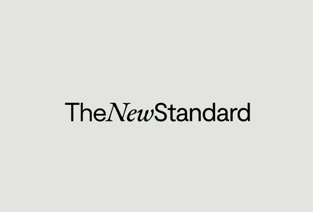
A logotype mixing sans-serif and italic serif letterforms to spell 'TheNewStandard', balancing two distinct type styles for visual contrast.
Summary
A logotype mixing sans-serif and italic serif letterforms to spell 'TheNewStandard', balancing two distinct type styles for visual contrast against a warm beige ground.
Visual description
Centered on a pale beige-gray background, the word 'TheNewStandard' is set in black. 'The' and 'Standard' are rendered in a geometric, condensed sans-serif; 'New' is slanted italic serif, a deliberate visual interruption. The mix creates rhythm, with the serif's diagonal stress contrasting the sans-serif's strict verticality. Ample space surrounds the letterforms, allowing each character to breathe and emphasizing restraint.
Key takeaway
The conceptual move of breaking a single word into typographic sections, using font mixing to create hierarchy and personality without additional color or ornament. The technique works because the contrast is legible yet subtle, and the baseline alignment holds the composition together despite the style shift.
Reuse notes
Strong for media and publishing brands where editorial sensibility matters. Works best when the typeface pairing is intentional and the word itself is substantial enough to carry the visual play. Avoid when clarity of the brand name must be paramount; the mixed styling adds sophistication at the cost of some immediate legibility.
More like this





Keep what you find
A free account saves references to boards and can send you a weekly email of picks based on what you save.
To see every result, go Pro.