Preview image. Unlock full-res
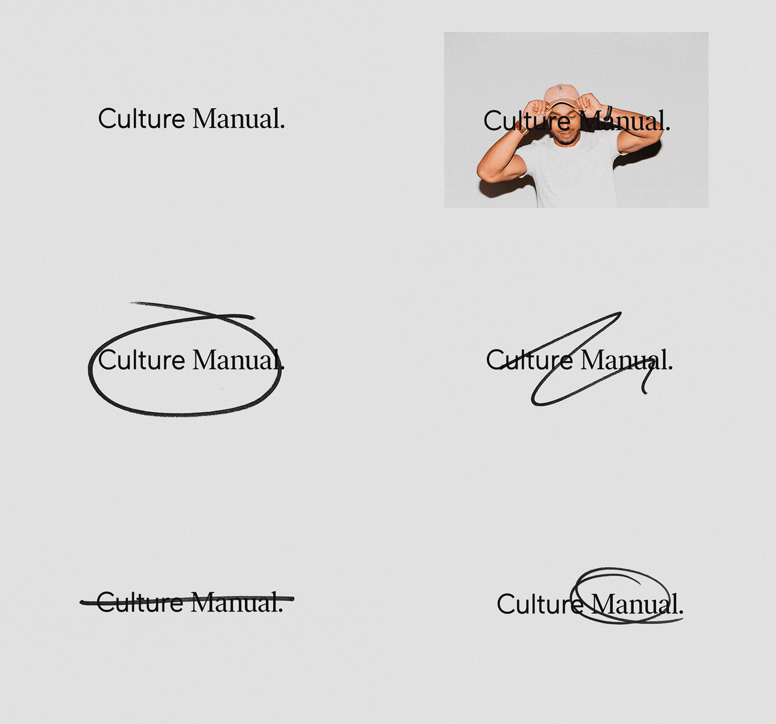
A refined editorial identity system using classical serif typography centered on neutral gray, demonstrating institutional minimalism through precision and whitespace.
Summary
A refined editorial identity using a single line of centered serif type with a period mark, proving that institutional branding can live in pure typographic restraint and whitespace.
Visual description
A neutral gray background with a centered classical serif typeface (likely Garamond or similar high-contrast serif) rendered in black. A single-line composition positioned in the upper-middle area with a period punctuation mark. Ample negative space surrounds the typography on all sides. The composition is perfectly centered horizontally and positioned with generous vertical breathing room, emphasizing clarity and refinement. Monochromatic palette of light gray, medium gray, black, and white.
Key takeaway
A single typographic element can carry full branding when paired with perfect centering and generous whitespace. Classical serifs paired with restrained punctuation feel authoritative without formality. Gray-on-gray palettes create softness while maintaining professional distance.
Reuse notes
Ideal for publishing houses, cultural institutions, museums, and media brands seeking understated authority. The minimalist approach scales well to editorial covers, signage, and digital interfaces. Works best when the typeface is well-known and distinctive on its own. Pair with serif body copy to maintain the refined aesthetic.
More like this




Keep what you find
A free account saves references to boards and can send you a weekly email of picks based on what you save.
To see every result, go Pro.