Preview image. Unlock full-res
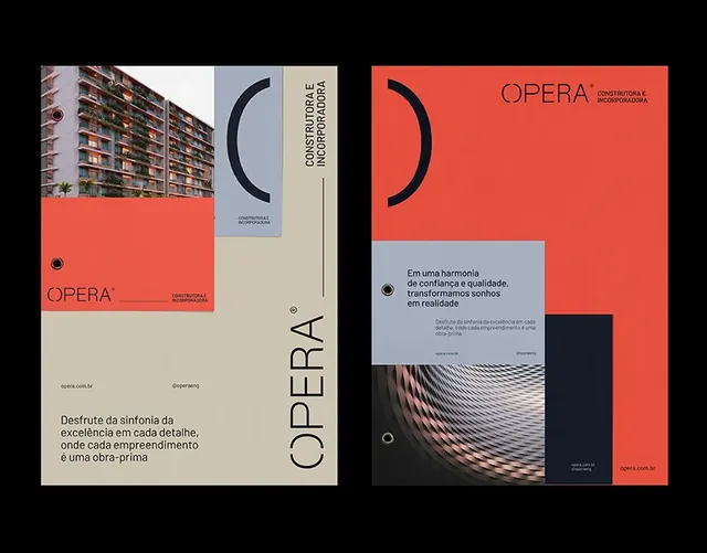
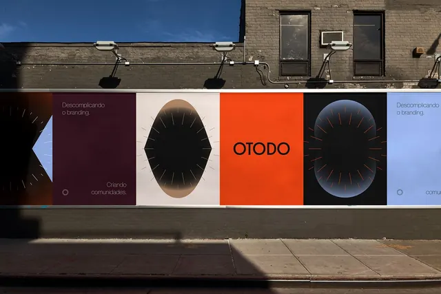
A brand identity system for OPERA using geometric arc and circle forms with a warm terracotta orange and neutral palette, shown across application contexts including photography, collateral, and architectural imagery.
Summary
A brand identity system for OPERA using geometric arc and circle forms with a warm terracotta orange and neutral palette, shown across application contexts including photography, collateral, and architectural imagery.
Visual description
Two panels present the OPERA brand system. The left panel shows logo applications: a large terracotta orange square with a thin black curve and the word "OPERA" in sans-serif, beside a tall orientation showing the same curve and wordmark in vertical alignment, and below a beige card with architectural photography and Portuguese-language body copy. The right panel displays secondary applications: a terracotta orange field with a large semi-circular black arc containing body text describing the brand concept, a tiled architectural photograph showing a residential building facade, and a footer with black rectangle and white type. Throughout, the palette remains consistent: warm terracotta orange, off-white cream, deep charcoal, and pale gray with ample negative space and restrained geometric shapes (the repeated arc motif) creating visual coherence.
Key takeaway
The consistent use of a single geometric element (the curved arc) as a recurring visual motif ties together diverse applications (cards, signage, interior spaces). The warm orange against neutrals creates memorable contrast while remaining sophisticated. The generous negative space and modular card-based layouts feel premium and uncluttered.
Reuse notes
Highly suitable for architecture, real-estate, design studio, or luxury service brands seeking a modern, premium aesthetic with minimal ornamentation. The terracotta-and-gray palette reads warm and approachable while the geometric restraint conveys confidence and professionalism. Best paired with high-quality photography of spaces, materials, or people that complement the earthy tones.
More like this






Keep what you find
A free account saves references to boards and can send you a weekly email of picks based on what you save.
To see every result, go Pro.