Preview image. Unlock full-res
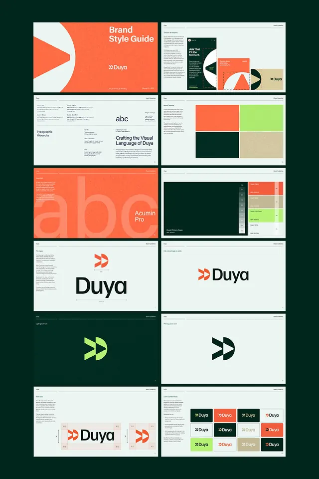
A twelve-page contact sheet of a Duya brand guideline showing logo construction, an Acumin Pro type scale, and an orange, dark-green and lime color system on dark backgrounds.
Summary
A presentation-board mosaic of a "Duya" brand guideline, twelve landscape pages tiled in a 2-column grid against a dark forest-green ground. It walks the full identity: cover, type, color, logo, mark, clearspace, and combinations.
Visual description
Twelve rounded-corner page thumbnails sit two-up on a near-black green background. The opening cover splits orange and off-white with a double-chevron logomark. Following pages cover a typographic hierarchy and an oversized "abc" naming Acumin Pro, large color blocks in burnt orange, lime green and sand, and a swatch table listing named brand colors with hex values. Logo pages show the "Duya" wordmark with its chevron, a full-color logo on white, and the chevron mark alone in lime and in dark green. The final spreads show a clearspace grid built on x-height units and a matrix of logo color combinations across orange, green, cream and dark fields. Every page uses a clean sans-serif with running header and footer labels.
Key takeaway
The whole deck commits to one accent flow: burnt orange as the loud lead, dark green as the steady base, lime as the pop, sand as the neutral. Seeing the logo stress-tested as a full combination matrix across every background is the move that proves an identity rather than just presenting it.
Reuse notes
Use as a structural reference when assembling a brand guideline of your own: the cover, type, color, mark, clearspace, combinations sequence is a reliable skeleton. The orange-green-cream split travels well to fintech, b2b SaaS, or any brand wanting warm-but-grounded. It reads best as a tiled board for portfolio presentation.
More like this






Keep what you find
A free account saves references to boards and can send you a weekly email of picks based on what you save.
To see every result, go Pro.