Preview image. Unlock full-res
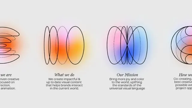
Four linked abstract concepts illustrated as organic overlapping shapes with warm-to-cool gradient fills, paired with simple headings and body copy.
Summary
Four linked abstract illustrations in overlapping organic shapes with smooth gradients (warm orange to cool blue) represent brand pillars: "Who we are", "What we do", "Our Mission", "How we work".
Visual description
Four abstract forms float horizontally across a light cream background. Each shape consists of overlapping rounded ellipses with smooth gradients: the first (warm orange-pink), second (golden-yellow), third (purple-to-blue), fourth (peach-to-pink). Delicate dotted lines trace contours across the shapes, suggesting internal structure and conceptual connection. Below each form sits a left-aligned sans-serif heading (14-16px, dark gray) followed by two lines of light gray body text explaining the concept. The spacing is generous, with ample breathing room between elements.
Key takeaway
The use of paired warm and cool gradients across a cohesive set to signal different but complementary ideas. The subtle dot-line overlay adds sophistication without visual clutter. The left-align text approach feels contemporary and less rigid than centered layouts.
Reuse notes
Perfect for agencies, studios, or service-based brands that need to communicate multiple core values or service categories in a harmonious way. The illustration style reads as creative and modern but remains professional. Works at multiple scales and in print or digital.
More like this



Keep what you find
A free account saves references to boards and can send you a weekly email of picks based on what you save.
To see every result, go Pro.