Preview image. Unlock full-res
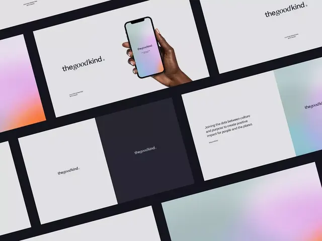
A cohesive brand identity system for theGoodKind, using soft gradient swatches (pink-to-violet, orange-to-teal) paired with a physical phone mockup showing the gradient on screen.
Summary
A cohesive brand identity system for theGoodKind, using soft gradient swatches (pink-to-violet, orange-to-teal) paired with a physical phone mockup showing the gradient on screen.
Visual description
A tilted overhead composition of overlapping design assets. Cream and light-gray background. Bold black diagonal stripe running across the frame. Visible elements include: white cards and panels with "theGoodKind" logotype in black sans-serif; soft-gradient rectangular swatches (pink fading to violet, orange bleeding to teal, gray-green swatches); a photograph of a dark hand holding an iPhone displaying a matching gradient (pink-to-purple) on its screen; additional brand stationery pieces with minimal black text on white; small descriptive text on some pieces (e.g., "Joining the dots between culture and purpose to create positive impact for people and the planet"). Clean, minimal typography throughout. Color palette is distinctly cool (purples, teals, soft neutrals) with warm orange accents.
Key takeaway
The gradient swatch system as a repeatable brand asset. Showing the same gradient applied across media (print swatches, app screen) to prove coherence. The overhead composition technique for brand-identity photography, mixing actual mockups with graphics. The restrained color vocabulary: cool pastels with one warm anchor.
Reuse notes
Effective for app-first or tech-forward brands wanting a cohesive identity across digital and print. The gradient system is flexible and scalable. Works well in portfolio and agency contexts where showing the system's breadth matters more than a single execution. The photography style (overhead, layered assets) is a strong brand-presentation technique.