Preview image. Unlock full-res
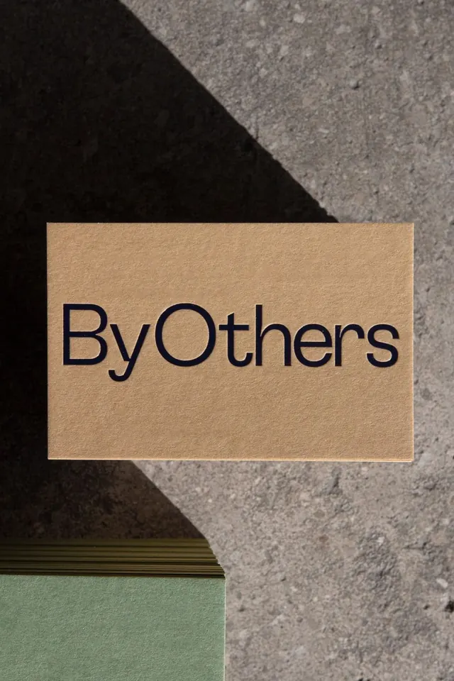
A sans-serif wordmark printed on unbleached kraft card photographed against a rough concrete background, pairing warm paper tone with cool stone texture.
Summary
A sans-serif wordmark printed on unbleached kraft card photographed against a rough concrete background, pairing warm paper tone with cool stone texture.
Visual description
A kraft-paper business card or label holds the all-lowercase wordmark "ByOthers" in a clean, modern sans-serif typeface with tightly tracked letters. The card sits at a shallow angle on a two-tone surface: cold charcoal concrete above and pale green-grey below, with the card's warm tan providing the focal contrast. The composition is diagonal, creating dynamic tension through the geometric interplay of materials and colors.
Key takeaway
The material contrast device: wordmark value comes from the interplay of three distinct surfaces (kraft, concrete, stone), not from ornament. The shallow card angle and off-center placement read as studied casualness without being staged.
Reuse notes
Effective for minimal branding presentations where the product itself (paper, printing, card stock) becomes the visual argument. Works especially well for stationery, portfolio, or packaging-focused brands.
More like this



Keep what you find
A free account saves references to boards and can send you a weekly email of picks based on what you save.
To see every result, go Pro.