Preview image. Unlock full-res
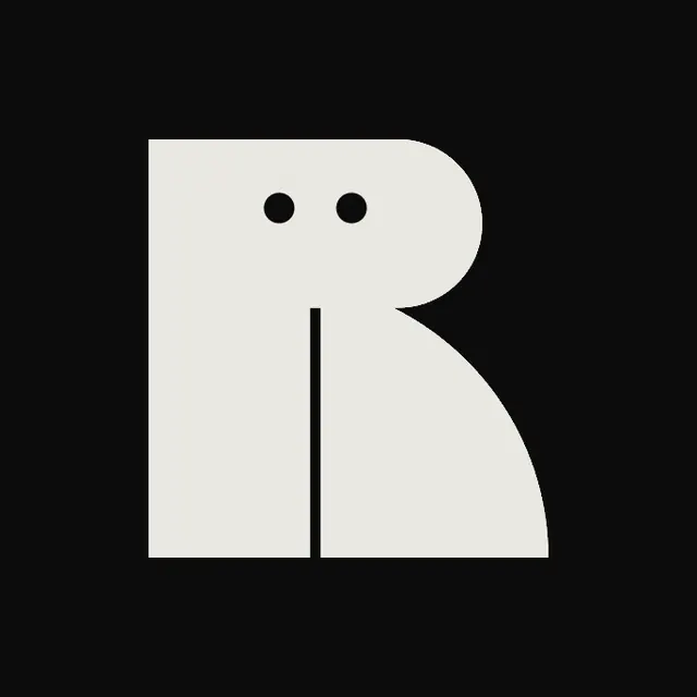
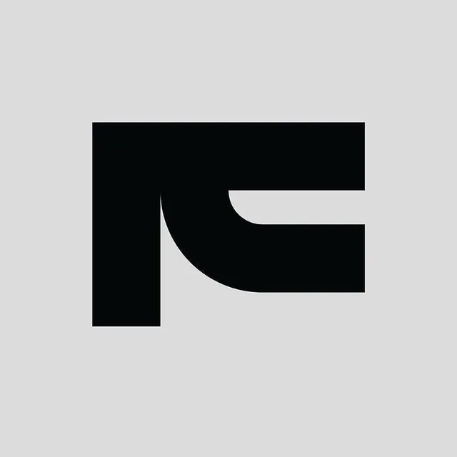
A monochrome letterform mark combining a rigid vertical rectangle with a curved swirl, creating balance between geometry and flow.
Summary
A monochrome letterform mark combining a rigid vertical rectangle with a curved swirl, creating balance between geometry and flow.
Visual description
A solid black graphic sits on a light gray ground. The mark is built from two elements: a thick vertical rectangle on the left and a curved form on the right that echoes the vertical height but curves inward, with a rounded notch cut from its top edge. The proportions are studied, with the curve's inward arc nearly touching the vertical shape's right edge, creating rhythm through proximity rather than contact.
Key takeaway
The mark uses positive and negative space with equal visual weight, making the background as much a part of the form as the solid black itself. The pairing of a strict geometric element (the rectangle) with one organic element (the curve) avoids being either too rigid or too fluid.
Reuse notes
Works for any brand needing a mark that reads as contemporary, technical, and controlled without sacrificing warmth. The mark is memorable despite being built from basic shapes, and scales well both large and small. Ideal for tech, creative services, or editorial brands.