Preview image. Unlock full-res
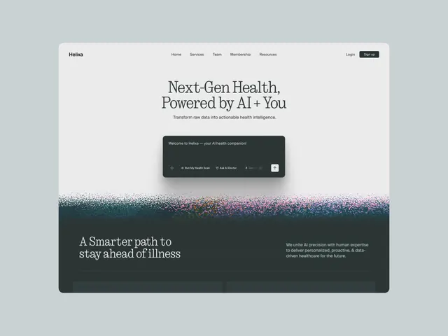
Minimalist healthcare SaaS landing page for an AI health companion, pairing serif headlines, grayscale palette, particle gradient divider, dark modal chat interface, and lifestyle photography.
Summary
A SaaS landing page hero for Helixa, an AI health companion, combining centered serif copy, a dark modal containing a chatbot interface, and a colorful particle gradient transitioning to moody photography below.
Visual description
The page is anchored by a clean light background (soft gray-blue) with a small serif-based "Helixa" logo and navigation menu top-left. The hero headline "Next-Gen Health, Powered by AI + You" sits in a large serif face, centered, with a supporting line "Transform raw data into actionable health intelligence." Below is a prominent dark modal featuring white text, icon buttons for health actions ("Run My Health Scan", "Ask AI Doctor"), and a secondary white button. A distinctive particle-gradient divider (starting dark teal, transitioning through magenta and pink speckles into white) sits below the modal; below that, moody lifestyle photography of a person and greenery fills the lower third, framed by the dark color band. The nav includes "Services", "Team", "Membership", "Resources" with login/sign-up buttons top-right.
Key takeaway
The particle gradient as a visual separator is bold and memorable; the dark modal sits with high contrast against the light hero, drawing focus; serif headlines paired with minimal sans navigation creates hierarchy without clutter; isolating the chat interface inside a framed UI (not full-screen) makes the interaction feel tangible and contained; the color palette shifts from neutral → colorful → dark without feeling chaotic.
Reuse notes
Effective for health-tech, fintech, or any AI-driven tool needing to feel sophisticated yet approachable. The serif headline reads premium; the dark modal + particle effect read modern. The photography placement grounds an otherwise minimal layout. Reverse the color approach (dark hero with light footer) if your brand leans colder or more technical.