Preview image. Unlock full-res
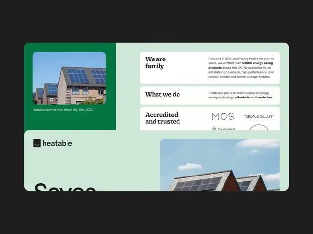
Brand identity for Heatable, a solar installer, combining deep green and mint split-screen layout with lifestyle photography, bold sans-serif headlines, and trust-focused copy blocks.
Summary
B2B branding for Heatable, a UK solar and battery installer, using a left-right split-screen to separate lifestyle photography (deep green) from informational content (mint), with rounded-corner framing and trust signaling including accreditation logos.
Visual description
Split-screen layout with rounded-corner outer frame on dark background. Left panel (deep green): overhead photograph of roof with installed solar panels, captioned in white sans-serif. Right panel (pale mint): stacked information cards with bold sans-serif headlines ("We are family", "What we do", "Accredited and trusted") paired with supporting copy in regular weight. Card 1 states company founding year (2013) and 50,000+ installations. Card 3 includes MCS and REA Solar certification marks and partial Trustpilot badge. Bottom section: full-width photograph of blue sky and residential solar installation on pitched roof. Heatable black-and-white logo sits in lower-left of green panel. Overall aesthetic balances warm human copy with cool, technical credibility cues.
Key takeaway
The split-screen strategy clearly separates emotional/lifestyle content from verifiable credentials, building trust through layout choice. Using only two accent colors (deep green + mint) with black/white simplifies recognition. Rounded corners on the outer frame soften corporate tone while maintaining professionalism. The stacked information hierarchy with short headlines and supporting copy reads naturally.
Reuse notes
Ideal for renewable energy, sustainability, or home services B2B brands emphasizing both environmental values and technical reliability. The photography-heavy approach requires strong lifestyle and installation imagery. Accent colors work with other green/teal combinations but become less distinctive if changed. Consider this for brands targeting both eco-conscious buyers and practical decision-makers simultaneously.