Preview image. Unlock full-res
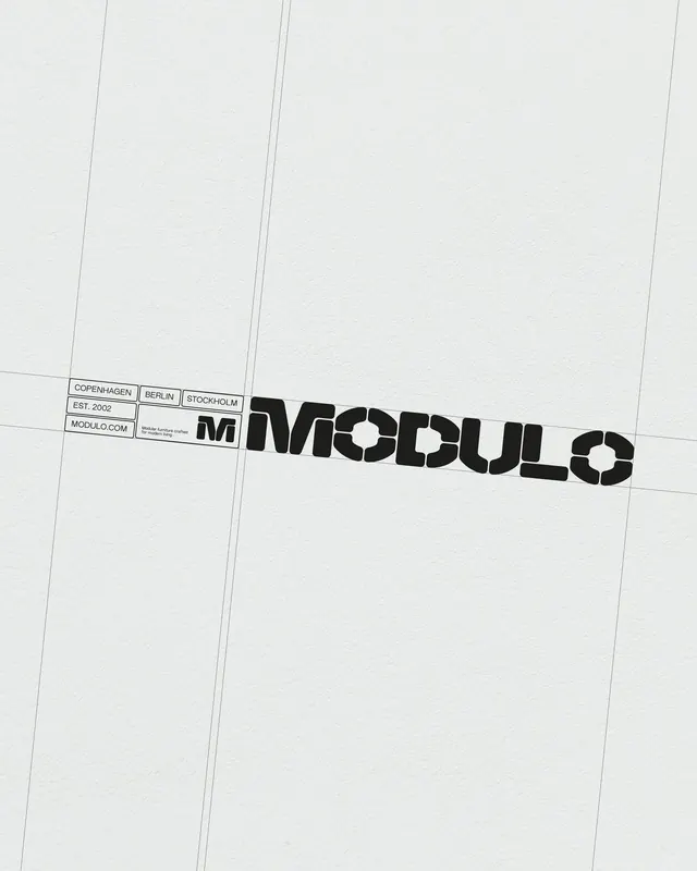
A bold geometric wordmark flanked by structured metadata, organized by a minimal grid of vertical and horizontal rules.
Summary
A bold geometric wordmark flanked by structured metadata, organized by a minimal grid of vertical and horizontal rules.
Visual description
The wordmark "MODULO" dominates the right half of the composition in a heavy, compressed sans-serif that reads as almost monolithic. To the left, small rectangular boxes contain paired metadata labels (location, founding year, web address) in a lighter sans-serif weight. Fine vertical and horizontal lines create a drafting-like grid overlay, suggesting architectural drawing or technical specification. The off-white background is minimal; black text provides stark contrast. The composition balances large display type against smaller informational elements through scale and visual weight alone.
Key takeaway
The brutalist grid as an organizational system, not decoration: it genuinely compartmentalizes information while adding a technical, contemporary edge. Pairing a single bold wordmark with auxiliary metadata at a much smaller scale creates visual hierarchy without color or illustrations. The geometric compression of the typeface reinforces the structural, engineered aesthetic.
Reuse notes
Strong for architecture practices, tech studios, or design consultancies seeking a cerebral, orderly identity. The grid system extends well to business cards, letterheads, and web layouts. The heavy geometric sans can feel austere on dark backgrounds; pair with generous white space. Works especially well at medium to large sizes where the typeface weight reads as intentional, not clumsy.
More like this








Keep what you find
A free account saves references to boards and can send you a weekly email of picks based on what you save.
To see every result, go Pro.