Preview image. Unlock full-res
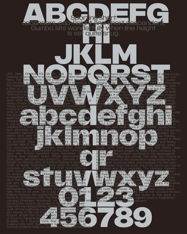
A high-contrast type specimen where overlapping and stacked letterforms create a dense textural field, emphasizing the architecture of sans-serif glyphs.
Summary
A high-contrast type specimen where overlapping and stacked letterforms create a dense textural field, emphasizing the architecture of sans-serif glyphs.
Visual description
The entire field is filled with a dark charcoal background densely packed with white and light-gray sans-serif letterforms. Capital letters, lowercase letters, and numerals overlap and layer at varying scales and rotations, creating visual rhythm through repetition and texture rather than message. The overlaid letterforms range from clearly legible to nearly obscured by layering. The composition reads as a unified texture rather than individual characters, with consistent sans-serif weight and stroke width throughout, allowing the focus to rest on the abstract interplay of form, negative space, and depth created through opacity and layering.
Key takeaway
The use of typography as a purely textural, compositional element rather than as readable text opens up experimental layouts for type-specimen design, branding materials, or editorial covers where conceptual meaning (exploring the letterform itself) matters more than communication. The monochromatic palette forces attention to scale, weight, and overlap relationships.
Reuse notes
Strong reference for typography-focused projects, experimental branding work, or editorial designs seeking intellectual minimalism. Works best when texture and form exploration are part of the project intent. Less suitable for legibility-first applications or where the alphabet needs to communicate a message directly.
More like this



Keep what you find
A free account saves references to boards and can send you a weekly email of picks based on what you save.
To see every result, go Pro.