Preview image. Unlock full-res
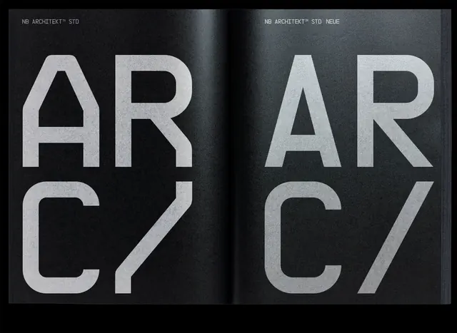
Specimen comparison of NB Architekt STD and NEUE typefaces rendered in massive, uppercase display weight against dark textured backgrounds.
Summary
A two-page type specimen showcasing NB Architekt STD and NEUE in maximum display size, letter-paired "AR C7" centered against coal-black and charcoal-gray textured backgrounds.
Visual description
Facing pages with the text "AR C7" set in oversized, chunky geometric sans-serif capitals. Left page displays "AR C7" in NB Architekt STD against a deep black background with subtle surface texture. Right page shows the same letters in NB Architekt NEUE (with straighter construction) against a charcoal-gray textured background. Both spreads emphasize the typeface's slab-like geometric construction with consistent stroke weight and precise letterforms. Light gray/white letter color creates extreme contrast. Small labels "NB ARCHITEKT STD" and "NB ARCHITEKT NEUE" identify each variant at top.
Key takeaway
The two-page comparison structure that lets you evaluate typeface variants side by side at display scale. The choice to use real letter-pairs (AR, C7) rather than abstract letterforms shows functional context. The textured backgrounds add subtle depth without competing with the type.
Reuse notes
Ideal for architecture, engineering, or technical branding systems where geometric precision and heavy strokes read as authoritative. Works well for system/product fonts requiring authority. The high contrast and austere aesthetic limit use to editorial, gallery, or corporate contexts. Not suitable for friendly, playful, or organic design work.
More like this





Keep what you find
A free account saves references to boards and can send you a weekly email of picks based on what you save.
To see every result, go Pro.