Preview image. Unlock full-res
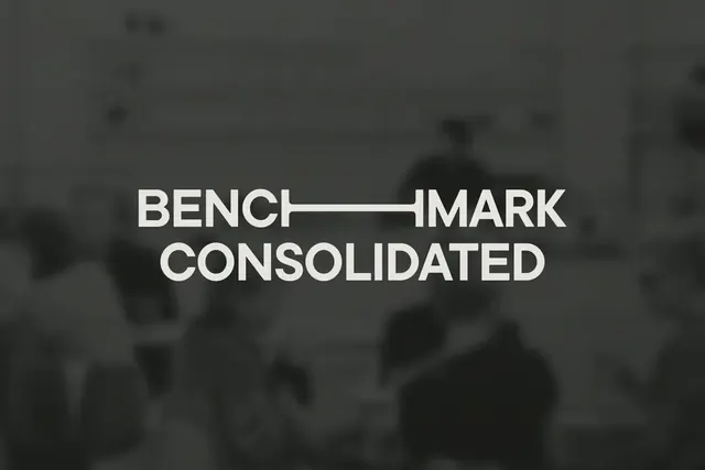
Bold sans-serif wordmark with a horizontal line connecting \"BENCH\" and \"MARK\" over \"CONSOLIDATED\" in two-line stacked typography.
Summary
Bold sans-serif wordmark with a horizontal line connecting "BENCH" and "MARK" over "CONSOLIDATED" in two-line stacked typography.
Visual description
The logo features the words BENCHMARK CONSOLIDATED in a white, bold, sans-serif uppercase typeface. A thin horizontal line separates the words BENCH and MARK on the top row. The text is centered against a blurred, dark grey background.
Key takeaway
Use a thin horizontal rule to create a deliberate break within a single word to add architectural interest to a typographic layout.
Reuse notes
Reach for this when designing a wordmark for industrial, real estate. Pairs with serious, corporate identity systems. Original by ONETOO.