Preview image. Unlock full-res
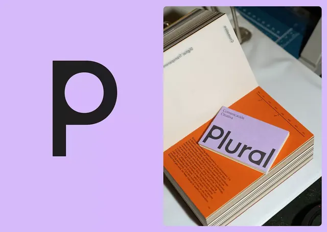
Branding for Plural (comunicación creativa) split across a soft-purple background on the left and an open magazine spread on the right, uniting geometric type with editorial photography.
Summary
Plural's communications agency branding combines a bold geometric sans-serif 'P' on a soft-purple field with an open guideline mockup showing how the mark integrates into editorial layouts.
Visual description
Left half: a large black letter 'P' with a full circular counter, set against a soft lavender background. Right half: an open brand guideline showing a pale cream page with stacked type and an orange cover beneath; the word 'Plural' and supporting text are visible, establishing the editorial system. The split emphasizes the mark's geometric boldness while the guideline mockup grounds it in practical application. Warm orange accents appear in the lower pages. The palette moves from cool purple to warm orange, anchored by black letterforms and neutral paper tones. Structured, confident, approachable aesthetic suitable for a creative services firm.
Key takeaway
The split-screen composition balancing a single letterform study against a real-world application. The complementary warm-cool palette (lavender and orange) working as mark identifier and accent. The handmade feel of the guideline presentation itself (visible binding, stacked pages) as part of the brand communication.
Reuse notes
Strong for agencies and creative studios targeting a sophisticated, editorial-leaning audience. The split layout works especially well in printed portfolios, pitch decks, or case-study presentations where you want to show both the mark and its context. The warm-cool contrast reads as premium and intentional; pair the purple and orange consistently to maintain that clarity. Works best with editorial or publication clients.
More like this






Keep what you find
A free account saves references to boards and can send you a weekly email of picks based on what you save.
To see every result, go Pro.