Preview image. Unlock full-res
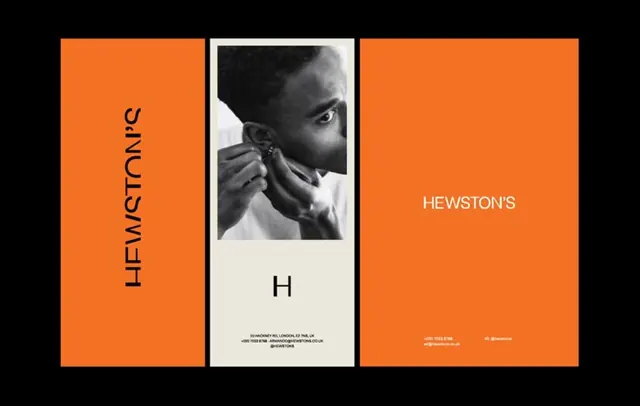
Type specimen for Hewston featuring a three-panel triptych layout, burnt-orange type panel, documentary portrait, and cream branding panel.
Summary
Type specimen for Hewston displayed as a three-panel composition: burnt-orange left panel with rotated sans-serif type, center strip with black-and-white portrait and branding, and solid orange right panel with wordmark and contact details.
Visual description
Three adjacent panels in landscape orientation. Left panel is solid burnt-orange with the word "HEWSTON" in a contemporary sans-serif rotated vertically, reading top-to-bottom. Center panel is off-white with a black-and-white portrait photograph of a person in profile (cropped tight at shoulders) above a large letter "H" and small metadata text at bottom. Right panel is solid burnt-orange matching the left, with "HEWSTON" wordmark in white sans-serif positioned mid-right, with a small website URL and social handle in white text at bottom. All edges are clean and aligned; the triptych creates a balanced, architectural composition through color blocking and typographic emphasis.
Key takeaway
The triptych structure itself, using warm color blocks to frame a centered information core. The rotation of type on the outer panels creates rhythm without animation. Pairing documentary photography (the portrait) with pure typography in adjacent sections creates editorial sophistication. The use of cream/off-white as a contained breathing space between the two burnt-orange panels.
Reuse notes
Strong reference for type-specimen design and portfolio showcases. The saturated burnt-orange works best paired with black-and-white imagery to avoid color clash. The layout scales well for print or large-format digital display. Consider for brands with bold, editorial positioning in creative or fashion verticals.
More like this





Keep what you find
A free account saves references to boards and can send you a weekly email of picks based on what you save.
To see every result, go Pro.