Preview image. Unlock full-res
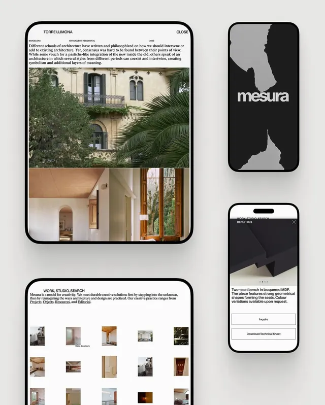
Multi-panel brand guideline layout for Torre Llimona showcasing architectural photography, editorial copy, and product mockups rendered on a light neutral background.
Summary
A brand guideline spread for Torre Llimona featuring interior and exterior architecture photography paired with black and white logo marks and product mockups demonstrating brand application.
Visual description
Light neutral background (off-white or pale gray) divided into a modular grid. Upper left holds a large rounded-corner frame containing two stacked architectural photos: ivy-covered neoclassical facade above, minimal modernist interior below. Upper right displays the Torre Llimona wordmark on solid black, with small positive-space silhouette marks below. Bottom left shows a grid of 15 thumbnail architectural and interior detail photographs in a 5x3 arrangement. Lower right contains a smartphone mockup in black displaying a product page with geometric shapes and text, labeled with product information and an "Inquire" button. All typography is sans-serif in black or dark gray on light backgrounds. Spatial rhythm is achieved through consistent padding and alignment to an invisible grid.
Key takeaway
The approach of showing architecture as product: cool, systematic documentation of spaces and details alongside functional mockups. The grid of thumbnail references acts as a searchable archive while the two large photos establish mood. Black and white wordmark marks are geometric and icon-like, easily separable from photography context. Typography hierarchy is clear without excess sizing variation.
Reuse notes
Works for heritage buildings, hospitality brands, architectural firms, and institutional organizations. The photography-first approach suits cultural or real-estate-focused brands. Best when you have consistent, beautiful architectural detail to show. The grid layout allows for flexible content updates without redesign.
More like this





Keep what you find
A free account saves references to boards and can send you a weekly email of picks based on what you save.
To see every result, go Pro.