Preview image. Unlock full-res
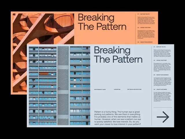
Two overlapping photography-guide layout spreads on black, each pairing an architectural photo with a large serif headline and tight multi-column body text.
Summary
Two near-identical "Breaking The Pattern" photography-guide spreads stacked at an offset on a black background, each leading with a tall architectural photo and a large two-line serif headline, with numbered body copy filling the right side.
Visual description
Each spread sits on a left-hand image column: the back spread on warm peach shows an orange spiraling concrete staircase; the front spread on white shows a repeating blue apartment facade cropped into vertical bands. To the right, "Breaking The Pattern" runs in a large light-weight serif over a thin rule. Body text is organized into short numbered sections (01 Capture The Eye, 02 Define Your Point) set in small sans-serif columns, with a footer line reading Photography Guide / Lesson One / Pattern In Architecture. The front spread ends with an oversized right-pointing arrow glyph and a pull paragraph in larger type.
Key takeaway
The numbered micro-section system (01, 02, 03) that turns a wall of body copy into a scannable index. Pairing a full-bleed pattern photo against the headline so the page literally demonstrates its topic. The big terminal arrow as a quiet next-page cue.
Reuse notes
A strong template for a guide, lookbook, or case-study spread where one photo and structured text must share a page. The serif headline over a sans body keeps it editorial rather than corporate. Needs a genuinely strong, pattern-heavy image in the left column to carry it.
More like this








Keep what you find
A free account saves references to boards and can send you a weekly email of picks based on what you save.
To see every result, go Pro.