Preview image. Unlock full-res
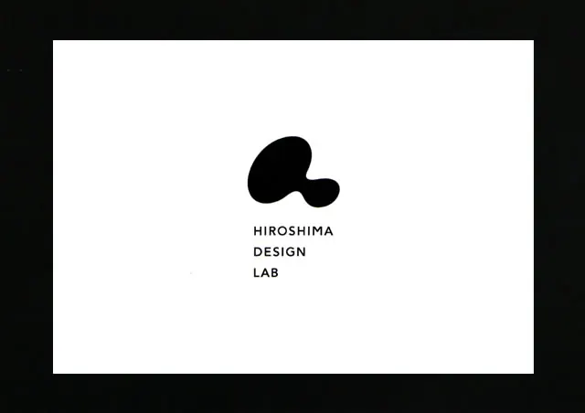
Minimal design studio logo featuring an organic black biomorphic mark paired with sans-serif wordmark, centered on white.
Summary
Minimal design studio logo featuring an organic black biomorphic mark paired with sans-serif wordmark, centered on white.
Visual description
A white rectangular canvas on black outer border holds the logo. Centered horizontally and positioned in the upper third is an abstract organic mark in solid black: two rounded, amoeba-like bulbous forms (roughly resembling a rotated, flattened B or a flowing shape) nested together. Below it, stacked in three lines, sits the wordmark in uppercase sans-serif: "HIROSHIMA / DESIGN / LAB". The type is letter-spaced with minimal weight, black on white, creating strong contrast. Generous white space surrounds the mark and text, emphasizing simplicity and balance. The composition is perfectly centered, using symmetry and axis-aligned alignment.
Key takeaway
The abstract mark as a memorable, character-like symbol distinct from the wordmark (mark + type as a system, not a merged lockup); using organic biomorphic form to soften geometric sans-serif type; centered composition and abundant white space to convey premium restraint.
Reuse notes
Ideal for design studios, creative consultancies, and cultural organizations seeking approachable sophistication. The mark's organic quality stands out on dark backgrounds or as a reversed mark (white on black). Scales well across digital and print applications without loss of legibility or charm.