Preview image. Unlock full-res
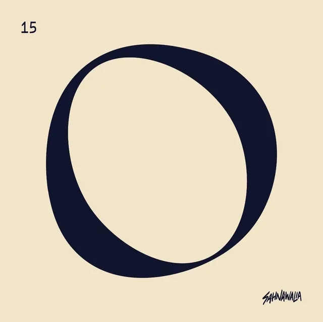
Minimalist geometric logo composed of a thick navy circle offset to create a curved O shape against a warm beige ground.
Summary
Minimalist brand identity using a thick offset navy circle forming the letter O, paired with a designer signature in brush script.
Visual description
A beige background anchors a centered composition. The main mark is a thickly stroked navy circle positioned to create negative space reading as the letter O, with a thin gap on the interior creating the open loop effect. A small sans-serif numeral (15) sits in the upper-left corner. In the lower-right, a delicate brush-script signature completes the identity system. The tonal restraint between the warm ground and cool navy creates stark legibility with minimal effort.
Key takeaway
The use of a simple curved stroke as a complete wordmark that's both literal (reads as a letter) and abstract (reads as a pure form). The economy of elements: background, mark, number, and signature suffice to establish a complete identity. High contrast between two colors carrying the entire design.
Reuse notes
Strong for studios, creative agencies, or portfolio sites seeking understated sophistication. The offset circle works well for monogram-based identities. Pair this approach with a sans-serif typeface for supporting copy to maintain the clean language.