Preview image. Unlock full-res
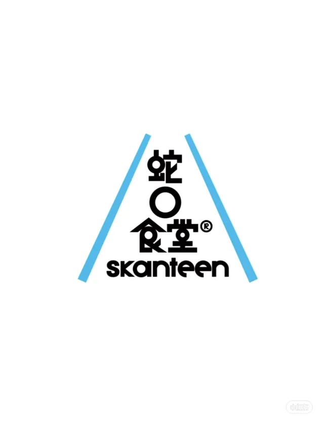
Skandeen restaurant identity using an upward-pointing cyan triangle to frame stacked Japanese characters and English wordmark in black.
Summary
Skandeen restaurant identity built on a geometric principle: an upward-pointing cyan triangle frames stacked Japanese characters and the English name in black sans-serif, centering the mark on a white ground.
Visual description
A cyan outline triangle points upward, its angled sides framing the composition. Inside, Japanese characters are stacked vertically in bold black typeface, centered above a large open circle. Below sits the wordmark "skandeen" in lowercase sans-serif. The entire mark sits centered on white. The triangle's clean geometry creates a natural frame that draws the eye inward, while the color blocking of cyan versus black creates stark, professional contrast.
Key takeaway
The triangle as a framing device that organizes and contains; the stacked/centered composition that makes the Japanese text co-equal with the Latin wordmark; the restraint of using only two colors plus white for maximum clarity.
Reuse notes
Strong for food, restaurant, or culturally-specific brands seeking a mark that respects multiple language systems equally. The cyan accent lifts what could be austere; works well at small sizes and on applications where bilingual clarity is essential.