Preview image. Unlock full-res
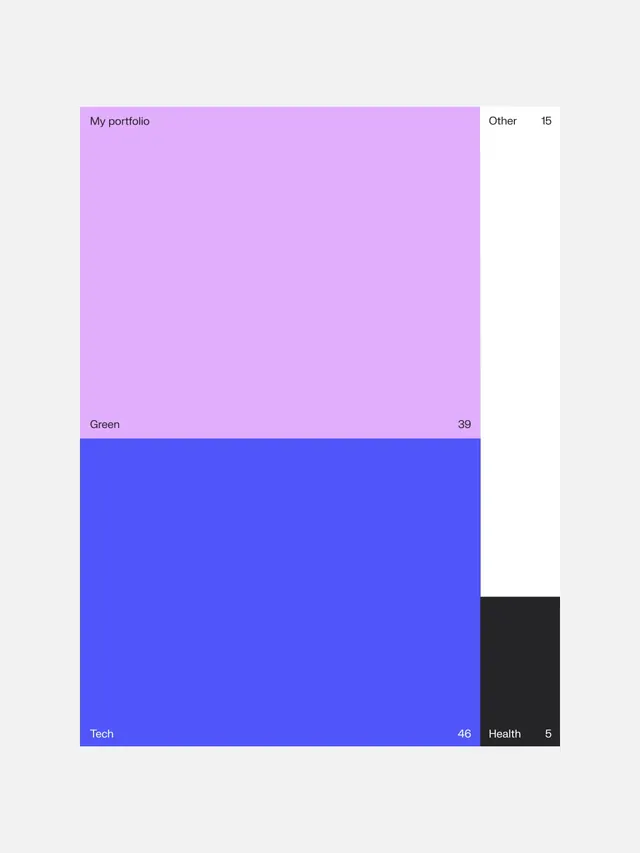
A portfolio statistics dashboard UI with color-coded category blocks and metric labels showing project counts.
Summary
A dashboard UI displaying portfolio project statistics with color-coded category blocks and metric counts.
Visual description
A light grey background contains a non-uniform grid of color blocks: a large lavender block labeled "My portfolio" with "Green" and a count of 39 below, a large blue block labeled "Tech" with a count of 46, and smaller blocks for "Other" (15) and "Health" (5) in white and black. All text is in black sans-serif, small and clearly legible at corners and edges of the blocks.
Key takeaway
High-contrast color blocking with minimal typography creates clear visual hierarchy for quick scanning of multiple metrics. Each colored region is immediately recognizable as a distinct category.
Reuse notes
Effective for dashboards, analytics interfaces, or portfolio management UIs. The varied block sizes suggest category importance. Works well when each color corresponds to a distinct project type or status.
More like this



Keep what you find
A free account saves references to boards and can send you a weekly email of picks based on what you save.
To see every result, go Pro.