Preview image. Unlock full-res
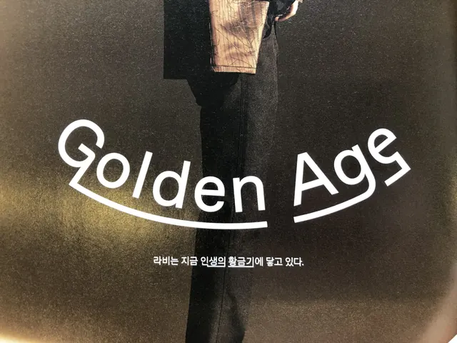
Dark editorial cover featuring large white logotype 'Golden Age' with a serif underline, anchored by a partially cropped sepia-toned figure below.
Summary
Dark editorial cover featuring large white logotype 'Golden Age' with a serif underline, anchored by a partially cropped sepia-toned figure below.
Visual description
The composition is vertically centered on a dark chocolate background, with white hand-drawn serif letterforms spelling 'Golden Age' positioned mid-frame. A thin serif underline runs the full width beneath the logotype. Below, a sepia-toned photograph of a cropped human figure in profile occupies the lower half, the figure's shoulder and head visible but face cut off. Korean text in a smaller sans-serif font appears below the logotype. The overall effect is dramatic and introspective, with the image working primarily through negative space, warm photography, and sharp typography contrast.
Key takeaway
Layering large dimensional serif type over figural photography to create narrative depth without complexity. The serif underline adds gravitas without additional graphics. Cropping the figure forces the eye to the typography while keeping the image human and personal.
Reuse notes
Effective for cultural publications, art magazines, or heritage brands requiring editorial sophistication. The monochrome palette and warm figure tone create nostalgia and authenticity. Works especially well when the figure needs to remain anonymous or when the concept (time, memory, tradition) is more important than the individual.
More like this









Keep what you find
A free account saves references to boards and can send you a weekly email of picks based on what you save.
To see every result, go Pro.