Preview image. Unlock full-res
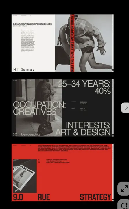
Multi-panel editorial spread using stark black and white photography split by a bold red vertical bar, with text and numeric data arranged in a modular grid.
Summary
Editorial spread combining black and white photography panels divided by a bold red vertical accent bar, with text hierarchies and demographic statistics arranged in a structured grid.
Visual description
Four-panel layout (roughly 2x2) alternates photographic and text-heavy sections. Upper left: monochrome portrait photograph. Upper right: dense gray body text (caption or article excerpt). Lower left: large red vertical bar serving as a visual divider, topped with white text reading "25-34 YEARS" and "OCCUPATION: CREATIVES", beneath which sits text "INTERESTS: ART & DESIGN!" Lower right: a solid red field with a product photograph (appears to be a consumer item) in the center-left, with text "3.0" and "RUE STRATEGY" in white at the bottom. All typography is rendered in a clean, geometric sans-serif; the composition relies entirely on geometric and chromatic contrast to separate zones. Negative space is minimal; the design prioritizes information density and visual impact.
Key takeaway
The use of a single bold accent color (red) as a structural column dividing related data groups, making the red bar both decorative and informational. The grid discipline that allows photographic imagery, text, and numeric data to coexist without hierarchy chaos. The restraint to monochrome + one warm accent, which forces the composition to rely on scale and positioning rather than color variety.
Reuse notes
Ideal for strategy presentations, demographic reports, organizational overviews, and editorial features that need to present multiple data classes simultaneously. The red divider pattern works well at any scale (from print to web) and is particularly effective when the page content has natural semantic groupings (before/after, problem/solution, audience/need). Works best with strong photography and well-kerned sans-serif type; weak photography or small type weakens the impact.
More like this




Keep what you find
A free account saves references to boards and can send you a weekly email of picks based on what you save.
To see every result, go Pro.