Preview image. Unlock full-res
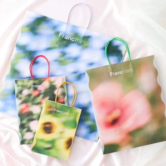
Soft lifestyle packaging system for Francfranc using nature photography and pastel handles in analogous color palettes.
Summary
Francfranc lifestyle bags feature each a distinct nature photograph printed on white paper, with colored wire handles (red, green, orange, yellow) anchoring the brand name in a clean sans-serif at top.
Visual description
Five vertically-oriented paper bags arranged on a soft pink fabric backdrop, each printed with a different close-up botanical or nature image: blurred blue sky with clouds, pink flowers, yellow-centered flowers, and green foliage. Each bag has a transparent handle in primary or secondary color (red, green, orange, yellow) and the word "Francfranc" in white sans-serif near the top. The bags tilt and overlap slightly, creating depth. The overall palette reads soft and muted, with the colored handles providing playful accent against the white bags and nature imagery.
Key takeaway
The use of distinct nature photography per package creates visual cohesion without repetition, while the thin colored handles signal brand personality without cluttering. The all-white typography lets both the imagery and handle color dominate, pairing modern minimal typography with organic visual content.
Reuse notes
Effective for lifestyle or eco-conscious brands targeting retail. Works when you have a set of high-quality nature or lifestyle photographs to differentiate each SKU. The colored handles are a memorable tactile detail that survives in customer memory even after unpacking.