Preview image. Unlock full-res
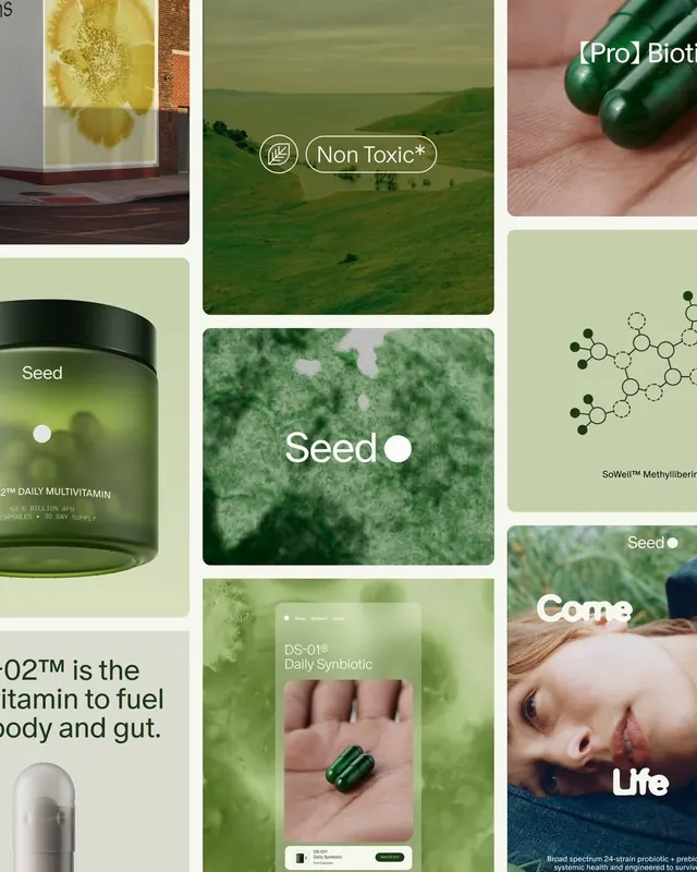
Wellness brand Seed visual system: grid collage mixing product photography, botanical imagery, landscape scenes, chemical diagrams, and lifestyle moments over soft sage-green backgrounds.
Summary
Wellness brand Seed visual system: grid collage mixing product photography, botanical imagery, landscape scenes, chemical diagrams, and lifestyle moments over soft sage-green backgrounds.
Visual description
Irregular grid layout combining nine panels in soft sage-green and cream backgrounds. Top-left features a close-up of pale powdered ingredient with subtle shadows. Top-center: "Non Toxic*" tagline overlaid on rolling green farmland with wheat stem icon. Top-right: close-up of three dark-green supplement capsules on skin. Center-left: a black glass jar labeled "Seed DAILY MULTIVITAMIN" with dosage information. Center: textured green surface with "Seed" logotype and dot. Center-right: molecular diagram labeled "SoWell™ Methyliberin" showing compound structure against pale-green background. Bottom-left: partial product label copy "...O2™ is the vitamin to fuel body and gut." Bottom-center: "DS-01™ Daily Synbiotic" product mockup on-skin. Bottom-right: lifestyle portrait of person's face with "Seed" and "Come to Life" tagline. Clean sans-serif typography (white on color) throughout. Overall mood is scientific yet organic, premium yet accessible.
Key takeaway
The irregular grid strategy (not rigid) that feels curated rather than templated. Mixing product shots, ingredient close-ups, science diagrams, and human moments to build credibility across multiple dimensions. The constrained green palette (sage to forest) suggesting natural purity. Minimal, white san-serif type that feels modern and trustworthy against nature-based imagery.
Reuse notes
Core reference for wellness, supplement, or nutraceutical brands. The collage format is ideal for showcasing ingredient story, efficacy, lifestyle, and community in one frame. Use when science and nature need equal visual weight. The sage-green palette works across digital and packaging; works best with aspirational but relatable imagery (not overly polished or sterile).
More like this



Keep what you find
A free account saves references to boards and can send you a weekly email of picks based on what you save.
To see every result, go Pro.