Preview image. Unlock full-res
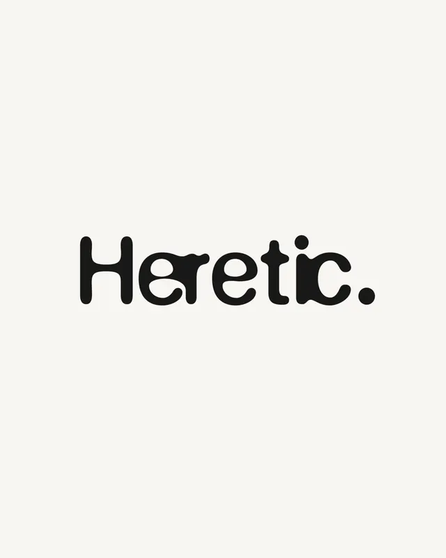
A bold, irregularly letterspaced wordmark in a rounded sans-serif with quirky character, balancing friendliness with graphic impact.
Summary
A bold, irregularly letterspaced wordmark in a rounded sans-serif with quirky character, balancing friendliness with graphic impact.
Visual description
The word "Heretic." is rendered in a thick, rounded sans-serif typeface centered on an off-white background. The letterforms are uniform but spaced irregularly, creating a playful, slightly off-balance rhythm that suggests personality without sacrificing legibility. All characters are solid black, creating high contrast against the warm neutral background. The letterforms have softened corners and generous bowls, typical of contemporary rounded typefaces.
Key takeaway
The irregular spacing of evenly-weighted letters creates movement and personality without introducing multiple weights. The monochromatic treatment and centered composition let the quirky letterform spacing carry the identity. Rounded geometry reads friendly while the bold weight maintains presence.
Reuse notes
Works well for lifestyle brands, community-driven platforms, or anything wanting personality with sophistication. The rhythm invites closer reading. Avoid pairing with serif typefaces; keep the secondary type equally straightforward.