Preview image. Unlock full-res
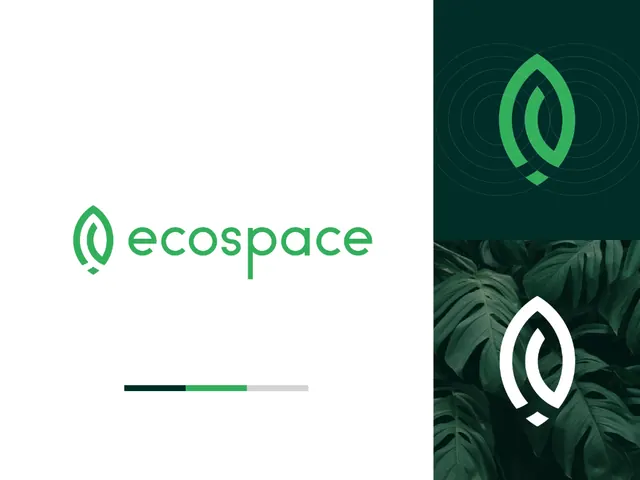
A green eco-themed brand identity layout showing a wordmark, emblem variations, and supporting visual panels.
Summary
A green eco-themed brand identity layout showing a wordmark, emblem variations, and supporting visual panels.
Visual description
The left side is mostly white space with a green leaf-like emblem and the word "ecospace" set in rounded lowercase type. A small horizontal color strip sits below the wordmark. The right side is split into two stacked panels: the top shows the emblem over concentric rings on a dark green background, and the bottom shows the emblem in white over dense tropical leaves.
Key takeaway
Use a restrained identity layout with lots of negative space and a single bright brand green to make the logo feel crisp. Reinforce the system with secondary panels that show the mark in different contexts and treatments.
Reuse notes
This works well for eco, wellness, or sustainability brands that need to feel modern rather than rustic. Reach for it when you want a simple brand sheet that communicates logo, palette, and mood in one glance.