Preview image. Unlock full-res
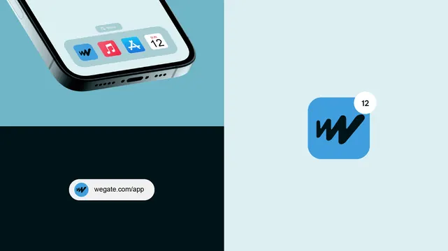
A split-screen brand identity composition shows a cropped phone mockup, an app icon with a notification badge, and a rounded website pill on contrasting light and dark blocks.
Summary
A split-screen brand identity composition shows a cropped phone mockup, an app icon with a notification badge, and a rounded website pill on contrasting light and dark blocks.
Visual description
The image is divided into a light cyan right side and a left side split between pale blue and deep black. In the upper left there is a cropped smartphone mockup with app icons on its screen, while the right side shows a blue rounded-square app icon with a small white notification circle reading 12. Near the lower left sits a white rounded pill containing a small circular icon and the text "wegate.com/app".
Key takeaway
Use a stark two-tone split background to frame separate brand moments, then punctuate the composition with a single badge or pill element for hierarchy. The cropped device mockup plus standalone icon creates a clean identity presentation without needing much copy.
Reuse notes
Reach for this when presenting a brand system, app icon, or launch asset in a minimal portfolio case study. It works best when the goal is to make a small number of brand elements feel polished and premium without visual clutter.