Preview image. Unlock full-res
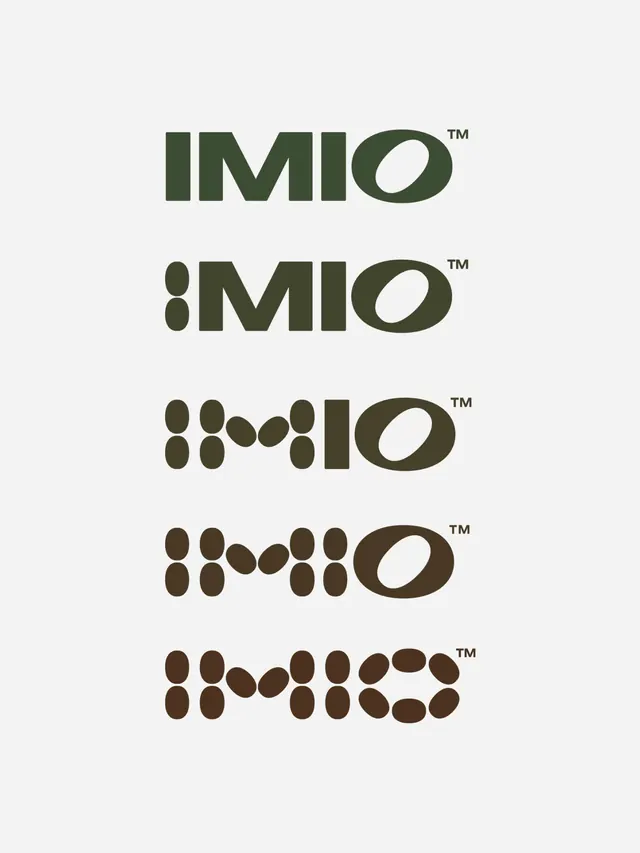
Wordmark system using geometric sans-serif letterforms, with 'IMIO' rendered in five logotype variations from minimal letter-only through progressively complex abstract pictorial forms.
Summary
A wordmark system built from the letterforms of IMIO, stacked in five progressively abstract variations from geometric sans-serif letters to a final biomorphic symbol composition on dark olive and cream.
Visual description
Five wordmark variations arranged vertically, each on a light neutral background. The first is a clean geometric sans-serif rendering of 'IMIO' in dark olive green. Each subsequent variation deconstructs the letters, replacing them with stacked ovals and curved shapes that suggest both the original typography and organic growth. The final version is nearly unreadable as language, composed entirely of rounded shapes arranged in a grid. All use consistent dark olive green and off-white color palette. Each wordmark is marked with a small TM symbol aligned to the upper right.
Key takeaway
The systematic typographic exploration from legible to abstract; the use of a single modular shape (the oval) to bridge letterform and pattern; dark warm earth tones grounding geometric forms; the restraint of the color palette across all variations.
Reuse notes
Works for brands exploring identity flexibility, modular identity systems, or mark evolution. The approach makes sense for companies in design, tech, or creative industries wanting to show adaptability.